"Artificial Intelligence without Big Data Analytics is lame, and Big Data Analytics without Artificial Intelligence is blind." Dr. O. Aly, Computer Science.
An important aspect of analyzing time-based data is finding trends.
From a reporting perspective, a trend may be just a smooth LASSO curve on the data points or just a line chart connection data points spread over time.
From an analytics perspective the trend can have different interpretations.
You will learn:
How to install AdventureWorks Sample Database into SQL Server.
How to export certain data from SQL Server to Excel.
How to load the Excel into PowerBI and analyze trends in data using PowerBI Desktop version.
Step-by-Step Instruction
Step-1: Install the AdventureWorks Sample Database
You will have a copy of the files with this workshop.
Step-2: Import the Backup file into SQL Server.
Import the backup file into SQL Server.
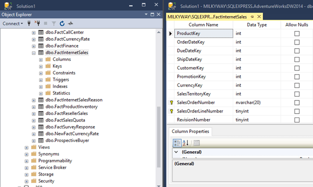
After importing the AdventureWorks into SQL server, you will have the database as follows.
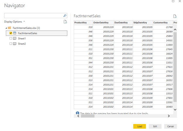
Step-3: Locate the Table dbo.FactInternetSales
This database has a number of tables to populate Power BI with the sample data.
We will be using the FactInternetSale table.
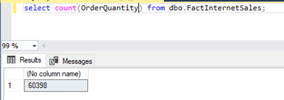
Step-4: Retrieve the total number of the records
Issue select statement to see how many rows in the table.
There are 60,398 records.
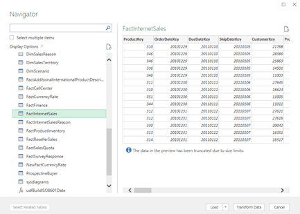
Step-5: Import the Table Content into Excel
Open Up Excel
Click on Data à Get Data à SQL Server.
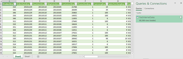
After loading the table in the Excel file, you will get something like the following.
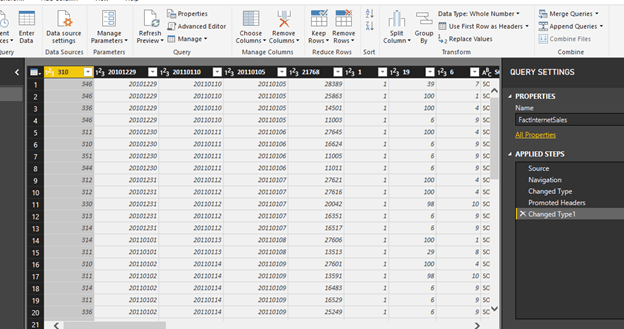
Step-5: Import Excel Into Power BI
Get Data
Select Excel
Step-6: Click Edit and Select Use First Row as Header
Click on Load.
Click Close and Apply
Step-7: Select the Desire Fields and Set up Their Properties
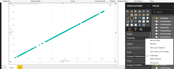
One standard method of analyzing two numerical values on a graph is by using scatterplot graph.
In a scatterplot graph, each value has an X-axis, and Y-axis is plotted on the graph using the values of two scales.
You will use the fields as Average of UnitPrice and Average of SalesAmount.
You also want to see this comparison over time, so you will add the OrderDate field in the Details section.
Select OrderDate, SalesAmount, UnitPrice.
Select Average of SalesAmount.
Select Average of UnitPrice.
Select OrderDate from OrderDate instead of Date Hierarchy.
Select the scatterplot icon from the visualizations pane and create a blank scatterplot graph on the report layout.
Select his blank graph, and add the fields as discussed above.
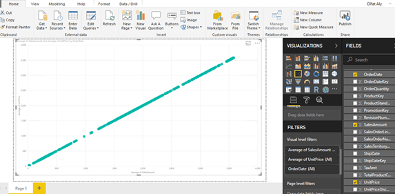
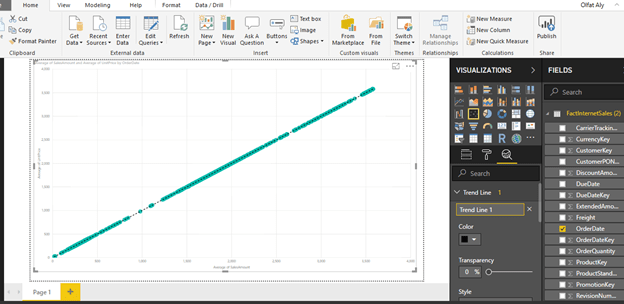
This will create a scatterplot chart of average of unit price vs. average of sales amount over time.
Step-8: Add a Trend Line
The chart seems to show linear relationship as the points seems to be organized in a straight line, but you cannot be sure just by reviewing visually.
The chart seems to show a series of points that are closely overlaid near or on the top of each other.
You need an explicit indicator of the same, like a project trend line in the graph.
To accomplish the same, click on Analytics Icon/Pane and you should find a trend-line option as shown below.
Click and Add to create a new trend line.
You can format the different options as shown below.
After adding the trend line, the graph should look as shown below.
This looks very trivial as you can create a trend using a line chart.
However, this trend is more like a linear trend line used in a linear regression method where the best-fit line passes through the minimum of squares distance/variance from all the points in the plot.
Linear regression analysis is part of statistical analysis which is part of machine learning techniques.
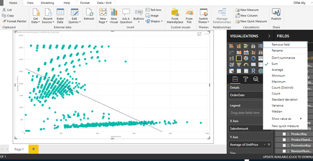
Step-9: Use Different Aggregation instead of Average Sales
You can try a different aggregation to look at a different trend.
Instead of the average of Sales Amount, change the aggregation to Sum of the Sales Amount.
To change the aggregation, you need to right-click on the field, and select the aggregation of choice from the menu as shown below.
Select Sum for Sales Amount
After making the change, the trend would look as shown below.
This shows that the trend is negative.
As the average of unit price decreases, the sum of sales amount increases.
From this limited trend analysis, without looking at the data, you can make an initial assumption that as the average of unit price of products increases, the sum total of overall sales decreases, but the average of sales increases.
This indicates that for expensive products the total sales is low.
As the number of products sold are less and the unit price is high, the average keeps on increasing shown a linear positive trend.
In this way, trend line enables quick interpretation of the data using different aggregations with trend lines.
The purpose of this project is to analyze a dataset using the correlation analysis and correlation plot in PowerBI.
Correlation Analysis is a fundamental method of exploratory data analysis to find a relationship between different attributes in a dataset.
Statistically, correlation can be quantified by means of a correlation coefficient, typically referred as Pearson’s co-efficient which is always in the range of -1 to +1.
A value of -1 indicates a total negative relationship and +1 indicates a total positive relationship.
Any number closer to zero represents very low or no relationship at all. There is a statistical calculation involved to find this co-efficient and using this you can identify the correlation between two attributes with numerical data.
It can be a very statistically intensive process if the task is to identify correlation between many numeric variables.
Correlation plots can be used to quickly calculate the correlation coefficients without dealing with a lot of statistics, effectively helping to identify correlations in a dataset.
Step-by-Step Instruction
Step-1: Install the R Package for Correlation Plot
Power BI provides correlation plot visualization in the Power BI Visuals Gallery to create Correlation Plots for correlation analysis.
In this tip we will create a correlation plot in Power BI Desktop using a sample dataset of car performance. It is assumed that Power BI Desktop is already installed on your development machine. So please follow the steps as mentioned below.
This visualization makes using of the R “corrplot” package. The same plot can be generated using the R Script visualization and some code. Instead this visualization eliminates the need for coding and provides parameters to configure the visualization.
The first step is to download the correlation plot
Install the R correlation package.
From the File à Import à custom visual from marketplace
Step-2: Expand the correlation plot to the entire area
After the correlation plot is added to the report layout, enlarge it to occupy the entire available area on the report. After you have done this, the interface should look as shown below.
Step 3: Download the CSV file (cars.csv)
Now that you have the visualization, it is time to populate it with some data on which correlation analysis can be performed.
You need a dataset with many numerical attributes.
The file contains data on car performance with metrics like
miles per gallon,
horsepower,
transmission,
acceleration,
cylinder,
displacement,
weight,
gears, etc.
Click on the Get Data menu and select CSV since we have the data in a csv file format.
Step-4: Edit the file and select “Use First Row as Header”
This will open a dialog box to select the file.
Navigate to the downloaded file and select it.
This will read a few records from the file and show a data preview as shown below.
The column headers are in the first row.
Click on the edit button to indicate this before importing the dataset.
Click on the “Use First Row as Headers” to get the column names properly.
You can also rename the Car Names column and name it Model.
Step-5: Apply the changes
After you apply the setting, the column names should look as shown below.
Click on the Close and Apply button to complete the import process.
Step-6: Import the data into the Power BI Desktop
The model should look as shown below.
Select the fields and add them to the visualization.
Click on the visualization in the report layout and add all the fields from the model except the model field which is a categorical / textual field.
The visualization would look as shown below.
Step-7: Points for consideration when reading the plot
The dark blue circles in a diagonal line from top left to bottom right shows correlation of an attribute with itself, which is always the strongest or 1. So this should not be read as correlation, but just as a separator line.
The more the circle has a dark blue color, it signifies stronger positive correlation. The darker the red color, it signifies a negative correlation. Lighter or white colors signifies weak or no correlation.
The scale can be used to estimate the correlation coefficient value.
Step-8: A Few Modifications in the Plot to Make it Visually Analyzable
Make a few modifications in this plot to make it visually analyzable.
Click on the Format option, in the Labels section and increase the font size, so that the field labels are clearly visible as shown below.
As you can see, weight (wt) has a strong positive correlation with displacement (disp) and miles per gallon (mpg) has a strong negative correlation with weight (wt).
The data is shown in a matrix format and there are many positive and negative correlation spreads in the plot.
Step-9: Draw a Cluster
It would be easier to analyze correlation if attributes with the same type of correlation are clustered together.
To do so, select the correlation plot parameters and set the “Draw clusters” property to “Auto”. This will cluster and reorganize the attributes as shown below.
Step-10: Add Number for Easy Analysis
The strength of the correlation is still shown by the depth of the color.
It would be easier to analyze the data if it is shown by a number indicating this strength – i.e. correlation coefficient.
To do so, switch On the Correlation Coefficients section and increase the font size, so that you can see the coefficient clearly.
Using the values as a reference, you can easily find out the strongest and weakest correlation in the entire dataset.
There are other sections for formatting the data, but those are mostly related to cosmetic aspects of the plot like title, background, transparency, title, etc.
You can try to modify those settings and make the plot more suitable to the theme of the report.
You can add Title from the Format section.
With Power BI, without digging into any coding or complex statistical calculations, one can derive correlation analysis from the data by using the correlation plot in Power BI Desktop.
The purpose of this
project is to analyze the online radio dataset called (lastfm.csv). The project
is divided into two main Parts. Part-I evaluates and examines the dataset for understanding the Dataset using the RStudio. Part-I involves three major tasks to review and understand the Dataset variables. Part-II discusses the Pre-Data Analysis, by
converting the Dataset to Data Frame, involving three major tasks to analyze the Data Frame. The Association Rule data
mining technique is used in this
project. The support for each of the 1004 artists is calculated, and the support is displayed for all artists with support
larger than 8% indicating that artists shown on the graph (Figure 4) are played by more than 8% of the users. The
construction of the association rules is also implemented using the function of
“apriori” in R package arules. The search was
implemented for artists or groups of artists who have support larger
than 1% and who give confidence to another
artist that is larger than
50%. These requirements rule out rare
artists. The calculation and the list of
antecedents (LHS) are also implemented which involve more than one artist. The list is further narrowed down by
requiring that the lift is larger than 5
and the resulting list is ordered
according to the decreasing confidence as illustrated in Figure 6.
Keywords:
Online
Radio, Association Rule Data Mining Analysis
Introduction
This project examines and analyzes the Dataset of (lastfm.csv). The dataset is downloaded from CTU course materials. The lastfm.csv dataset reflect online radio which keeps track of every thing the user plays. It has 289,955 observations with four variables. The focus of this analysis is Association Rule. The information in the dataset is used for recommending music the user is likely to enjoy and supports focused on marketing which sends the user advertisements for music the user is likely to buy. From the available information such as demographic information (such as age, sex and location) the support for the frequencies of listeninig to various individual artists can be determined as well as the joint support for pairs or larger groupings of artists. Thus, to calculate such support, the count of the incidences (0/1) (frequency) is implemented across all memebers of the network and divide those frequencies by the number of the members. From the support, the confidence and the lift is calculated.
This
project addresses two major Parts. Part-I covers the following key Tasks to
understand and examine the Dataset of “lastfm.csv.”
Task-1: Review the Variables of the Dataset.
Task-2: Load and Understand the Dataset Using
names(), head(), dim() Functions.
Task-3: Examine the Dataset,
Summary of the Descriptive Statistics, and Visualization of the Variables.
Part-II
covers the following three primary key Tasks to the plot, discuss and analyze the result.
Task-1: Required Computations for
Association Rules and Frequent Items.
Task-2: Association Rules.
Task-3: Discussion and Analysis.
Various resources were utilized to develop the required code using R. These resources include(Ahlemeyer-Stubbe & Coleman, 2014; Fischetti, Mayor, & Forte, 2017; Ledolter, 2013; r-project.org, 2018).
The
purpose of this task is to understand the variables of the dataset. The Dataset is “lastfm.csv” dataset. The Dataset describes the artists and the
users who listens to the music. From the available information such as
demographic information (such as age, sex and location) the support for the
frequencies of listeninig to various individual artists can be determined as
well as the joint support for pairs or larger groupings of artists. There are 4 variables. Table 1 summarizes the selected variables for
this project.
The purpose of this task is to load and understand the Dataset using names(), head(), dim() function. The task also displays the first three observations.
## reading the data
lf <-read.csv(“C:/CS871/Data/lastfm.csv”)
lf
dim(lf)
length(lf$user)
names(lf)
head(lf)
lf <- data.frame(lf)
head(lf)
str(lf)
lf[1:20,]
lfsmallset <- lf[1:1000,]
lfsmallset
plot(lfsmallset, col=”blue”, main=”Small Set of Online Radio”)
Figure 1. First Sixteen Observations for User (1) – Woman from Germany.
Figure 2. The plot of Small Set of Last FM Variables.
The purpose of this task is to
examine the dataset. This task also factor
the user and levels users and artist variables.
It also displays the summary of the variables and the visualization of
each variable.
The
purpose of this task is to first implement computations which are required for
the association rules. The required
package arules is first installed. This
task visualizes the frequency of items in Figure 4.
##
Install arules library for association rules
install.packages(“arules”)
library(arules)
###
computational environment for mining association rules and frequent item sets
playlist
<- split(x=lf[,”artist”], f=lf$user)
playlist[1:2]
##
Remove Artist Duplicates.
playlist
<- lapply(playlist,unique)
playlist
<- as(playlist,”transactions”)
##
view this as a list of “transaction”
##
transactions is a data class defined in arules
itemFrequency(playlist)
##
lists the support of the 1,004 bands
##
number of times band is listed to on the playlist of 15,000 users
##
computes relative frequency of artist mentioned by the 15,000 users
The purpose of this task is to implement the data
mining for the music list (lastfm.csv) using Association Rules technique. First, the code builds the Association Rules, followed by the implementation of the
associations with support > 0.01 and confidence > 0.50. Rule out rare
bands and ordering the result by confidence for better understanding of the
association rules result.
## Build the Association Rules
## Only associations with support > 0.01 and confidence
> 0.50
The association rules are
used to explore the relationship between items and sets of items (Fischetti et al.,
2017; Giudici, 2005). Each
transaction is composed of one or more items.
The interest is in transactions of at least two items because there
cannot be relationships between several items in the purchase of a single item (Fischetti et al.,
2017).
The association rule is the explicit mention in a relationship in the data, in
the form of X >= Y, where X (the antecedent) can be composed of
one or several items and is called
itemset, and Y (the consequent) is always one single item. In this project, the interest is in the
antecedents of music since the interest is in promoting the purchase of
music. The frequent “itemsets” are the
items or collections of items which frequently
occur in transactions. The
“itemsets” are considered frequent if they occur more frequently than a
specified threshold (Fischetti et al.,
2017). The threshold is called minimal support (Fischetti et al.,
2017). The omission of “itemsets” with support less
than the minimum support is called
support pruning (Fischetti et al.,
2017).
The support for an itemset is the proportion among all cases where the itemset
of interest is present, which allows estimation of how interesting an itemset or a rule is when support is low, the
interest is limited (Fischetti et al.,
2017).
The confidence is the proportion of cases of X where X >= Y, which
can be computed as the number of cases
featuring X and Y divided by the number of cases featuring X (Fischetti et al.,
2017). Lift is a measure of the improvement of the
rule support over what can be expected by
chance, which is computed as support(X>=Y)/support(X)*support(Y) (Fischetti et al.,
2017). If the lift value is not higher than 1, the
rule does not explain the relationship between the items better than could be
expected by chance. The goal of
“apriori” is to compute the frequent “itemsets” and the association rules efficiently and to compute support and confidence.
In this project, the large dataset of lastfm (289,955 observations and
four variables) is used. The descriptive analysis shows that the
number of males (N=211823) exceeds
the number of female users (N=78132)
as illustrated in Figure 3. The top
artist has a value of 2704, followed by “Beatles” of 2668 and “Coldplay” of
2378. The top country has the value of
59558 followed by the United Kingdom of
27638 and German of 24251 as illustrated in Task-3 of Part-I.
As
illustrated in Figure 1, the first sixteen observations are for the user (1) for a woman from Germany, resulting in
the first sixteen rows of the data matrix.
The R package arules was used for
mining the association rules and for identifying frequent “itemsets.” The data is
transformed into an incidence matrix where each listener represents a
row, with 0 and 1s across the columns indicating whether or not the user has
played a particular artist. The incidence matrix is stored in the R object
“playlist.” The support for each of the 1004 artists is calculated, and the support is displayed for all artists with support
larger than 8% indicating that artists shown on the graph (Figure 4) are played by more than 8% of the users.
The construction of the association rules is also
implemented using the function of “apriori” in R package arules.
The search was implemented for
artists or groups of artists who have support larger than 1% and who give
confidence to another artist that is larger than 50%. These requirements rule out rare
artists. The calculation and the list of
antecedents (LHS) are also implemented which involve more than one artist. For instance, listening both to “Muse” and
“Beatles” has support larger than 1%, and the confidence for “Radiohead,” given
that someone listens to both “Muse” and “Beatles” is 0.507 with a lift of 2.82
as illustrated in Figure 5. This result
exceeded the two requirements as antecedents involving three artists do not
come up in the list because they do not meet both requirements. The list is further narrowed down by
requiring that the lift is larger than 5 and the resulting list is ordered according to the decreasing
confidence as illustrated in Figure 6.
The result shows that listening to both “Led Zeppelin” and “the Doors”
has a support of 1%, the confidence of
0.597 (60%) and lift of 5.69 and is quite predictive of listening to “Pink
Floyd” as shown in Figure 6. Another example of the association rule result is
listening to “Judas Priest” lifts the chance of listening to the “Iron Maiden”
by a factor of 8.56 as illustrated in Figure 6.
Thus, if the user listens to “Judas Priest,” the recommendation for that
user to also to listen to “Iron Maiden.”
The same association rules results apply to all of the six items listed
in Figure 6.
References
Ahlemeyer-Stubbe, A.,
& Coleman, S. (2014). A practical
guide to data mining for business and industry: John Wiley & Sons.
Fischetti,
T., Mayor, E., & Forte, R. M. (2017). R:
Predictive Analysis: Packt Publishing.
Giudici,
P. (2005). Applied data mining:
statistical methods for business and industry: John Wiley & Sons.
Ledolter,
J. (2013). Data mining and business
analytics with R: John Wiley & Sons.
The purpose of this discussion is to use the prostate cancer dataset available in R, in which biopsy results are given for 97 men. This goal is to predict tumor spread, which is the log volume in this dataset of 97 men who had undergone a biopsy. The measures which are used for prediction are BPH, PSA, Gleason Score, CP, and size of the prostate. The predicted tumor size affects the treatment options for the patients, which can include chemotherapy, radiation treatment, and surgical removal of the prostate.
The dataset “prostate.cancer.csv” is downloaded from the CTU course learning materials. The dataset has 97 observations or patients on six variables.The response variable is the log volume (lcavol). This assignment is to predict this variable (lcavol) from five covariates (age, logarithms of bph, cp, and PSA, and Gleason score) using the decision tree. The response variable is a continuous measurement variable. The sum of squared residuals as the impurity (fitting) criterion is used in this analysis.
This assignment
discusses and addresses fourteen Tasks as shown below:
Various resourceswere utilized to develop the required code using R. These resources include(Ahlemeyer-Stubbe & Coleman, 2014; Fischetti, Mayor, & Forte, 2017; Ledolter, 2013; r-project.org, 2018)
Task-1: Understand the Variables of the Data Sets:
The purpose of this task is to understand the variables of the dataset. The dataset has 97 observations or patients with six variables. The response variable for prediction is (lcavol), and the five covariates (age, logarithms of bph, cp, and PSA, and Gleason score) will be used for this prediction using the decision tree. The response variable is a continuous measurement variable. Table 1 summarizes these variables including the response variable of (lcavol).
Table 1: Prostate Cancer Variables.
Task-2: Load and Review the Dataset using names(), heads(), dim() functions
pc
<- read.csv(“C:/CS871/prostate.cancer.csv”)
pc
dim(pc)
names(pc)
head(pc)
pc
<- data.frame(pc)
head(pc)
str(pc)
pc
<-data.frame(pc)
summary(pc)
plot(pc,
col=”blue”, main=”Plot of Prostate Cancer”)
Figure 1. Plot of Prostate Variables.
Task-3: Distribution of Prostate Cancer Variables.
####
Distribution of Prostate Cancel Variables
###
These are the variables names
colnames(pc)
##Setup
grid, margins.
par(mfrow=c(3,3),
mar=c(4,4,2,0.5))
for
(j in 1:ncol(pc))
{
hist(pc[,j],
xlab=colnames(pc)[j],
main=paste(“Histogram
of”, colnames(pc)[j]),
col=”blue”,
breaks=20)
}
hist(pc$lcavol,col=”orange”)
hist(pc$age,col=”orange”)
hist(pc$lbph,col=”orange”)
hist(pc$lcp,col=”orange”)
hist(pc$gleason,col=”orange”)
hist(pc$lpsa,col=”orange”)
Figure 2. Distribution of Prostate Cancer Variables.
The classification and regression tree (CART)
represents a nonparametric technique
which generalizes parametric regression models (Ledolter, 2013).
It allows for non-linearity and variables interactions with no need to
specify the structure in advance. Furthermore, the violation of constant
variance which represents a critical assumption in the regression model is not
critical in this technique (Ledolter, 2013).
The descriptive statistics result shows that lcavol has a mean of 1.35 which is less than the median of 1.45
indicating a negatively skewed distribution, with a minimum of -1.35 and a maximum of 2.8. The age of the prostate cancer
patients has an average of 64 years, with a minimum of 41 and a maximum of 79 years old. The lbph
has an average of 0.1004 which is less than the median of 0.300 indicating the
same negatively skewed distribution with a minimum of -1.39 and maximum of
2.33. The lcp has an average of -0.18 which is higher than the median of -0.79 indicating a positive skewed distribution with a minimum of -1.39 and a maximum of 2.9.
The Gleason measure has a mean of
6.8 which is a little less than the median of 7 indicating a little negative
skewed distribution with a minimum of 6 and maximum of 9. The last variable of lpsa has an average of 2.48 which is a little less than the median
of 2.59 indicating a little negatively skewed distribution with a minimum of
-0.43 and maximum of 5.58. The result shows that there is a positive
correlation between lpsa and lcavol, and between lcp and lcavol as well. The result also shows that the age between 60
and 70 the lcavol gets increased.
Furthermore, the result also
shows that the Gleason result takes
integer values of 6 and larger. The
result of the lspa shows that the log PSA
score, is close to the normally distributed dataset. The result in
Task-4 of the correlation among prostate variables is not surprising as it
shows that if
their Gleason score is high now, then they likely had a bad history of Gleason
scores, which is known for such high Gleason.
The result also shows that lcavol
as a predictor should be included for any
prediction of the lpsa.
As illustrated in Figure 4, the result shows that PSA is highly correlated with the log of cancer
volume (lcavol); it appeared to have a
highly linear relationship. The result
also shows that multicollinearity may
become an issue; for example, cancer volume is
also correlated with capsular penetration, and this is correlated with
the seminal vesicle invasion.
For the implementation of the Tree, the initial tree
has 12 leave nodes, and the size of the tree is thus 12 as illustrated in
Figure 5. The root shows the 97 cases
with deviance of 133.4. Node 1 is the root; Node
2 has a value of lcp < 0.26 with 63
patients and deviance of 64.11. Node 3
has the value of lcp > 0.26 with 34
cases and deviance of 13.39. Node 4 has
the lpsa < 2.30 with 35 cases and
deviance of 24.72. Node 5 has lpsa >
2.30 with 28 cases and 18.6 deviance.
Node 6 has lcp < 2.14 with 25 cases
and deviance of 6.662. Node 7 has lcp > 2.139 with 9 cases and deviance of
1.48. Node 8 has lpsa < 0.11 with 4
cases and deviance of 0.3311, while Node 9 has lpsa
> 0.11 with 31 cases and deviance of 18.92, and age of < 52 with deviance
of 0.12 and age o > 52 with deviance of 13.88. Node 10 has lpsa < 3.25 with 23 cases and deviance of
11.61. while Node 11 has lcp > 3.25 with 5
cases and deviance of 1.76. Node
12 is for age < 62 with 7 cases and deviance of 0.73.
The first pruning process using α=1.7 did not result
in any different from the initial
tree. It resulted in the 12 nodes. The second pruning with α=2.05 improved the
tree with eight nodes. The root shows the same result of 97 cases
with deviance of 133.4. Node 1 has lcp < 0.26 with deviance of 64.11 while Node 2 has lcp
> 0.26 with deviance of 13.39. The third pruning using α=3 has further
improved the tree as shown in Figure 8.
The final Tree has the root with four nodes: Node 1 for lcp < 0.26 and Node 2 for lcp > 0.26.
Node 3 has lpsa < 2.30, while Node 4 reflects lpsa > 2.30. With regard to the prediction, the patient with
lcp=0.20, which is categorized in Node 2,
and lpsa of 2.40 which is categorized in Node 4, can be predicted to
have a log volume of (lcavol) of 1.20.
The biggest challenge for the CART model which is described
as flexible, in comparison to the regression models, is the overfitting (Giudici, 2005; Ledolter, 2013). If the splitting algorithm is not stopped, the tree algorithm can
ultimately extract all information from the data, including information which
is not and cannot be predicted in the population with the current set of
prediction causing random or noise variation (Ledolter, 2013). However, when the subsequent splits add minimal improvement of the prediction, the stop
of generating new split nodes, in this case, can be used as a defense against
the overfitting issue. Thus, if 90% of
all cases can be predicted correctly from 10 splits, and 90.1% of all cases
from 11 splits, then, there is no need to add the 11th split to the
tree, as it does not add much value only .1%. There are various techniques to stop the split process. The basic
constraints (mincut, mindev) lead to a full tree fit with a certain
number of terminal nodes. In this case
of the prostate analysis, the mincut=1 is used
which is a minimum number of observations to include in a child node and obtained a tree of size 12.
Since the three-building is stopped as illustrated in Figure 10, the cross-validation is
used to evaluate the quality of the prediction of the current tree. The cross-validation subjects the tree
computed from one set of observation (the training sample) to another
independent set of observation (the test sample). If most or all of the splits
determined by the analysis of the training sample are based on random noise, then the prediction for the test sample
is described to be poor. The
cross-validation cost or CV cost is the averaged error rate for particular tree size. The tree size which produces the minimum CV
cost is found. The reference tree is then pruned back to the number of nodes matching the size which
produces the minimum CV cost. Pruning was implemented in a stepwise bottom-up manner,
by removing the least important nodes
during each pruning cycle. The v-fold CV is
implemented with the R command (cv.tree). The graph in Figure 13 of the
CV Deviance indicates that, for the prostate example, a tree of size 3 is
appropriate. Thus, the reference tree
which was obtained from all the data is being pruned back to size 3. CV chooses the
capsular penetration and PSA as the decision variable. The effect of capsular penetration on the
response of log volume (lcavol) depends
on PSA. The final graph of Figure 15 shows that the CAR divides up the space of the explanatory variables into
rectangles, with each rectangle leading to a different prediction. The size of
the circles of the data points in the respective rectangles reflects the
magnitude of the response. Figure 15 confirms
that the tree splits are quite reasonable.
References
Ahlemeyer-Stubbe, A., & Coleman,
S. (2014). A practical guide to data
mining for business and industry: John Wiley & Sons.
Fischetti, T.,
Mayor, E., & Forte, R. M. (2017). R:
Predictive Analysis: Packt Publishing.
Giudici, P.
(2005). Applied data mining: statistical
methods for business and industry: John Wiley & Sons.
Ledolter, J.
(2013). Data mining and business
analytics with R: John Wiley & Sons.
The purpose of this discussion is to discuss and analyze creating ensembles from different methods such as logistic regression, nearest neighbor methods, classification trees, Bayesian, or discriminant analysis. This discussion also addresses the use of the Random Forest to do the analysis.
Ensembles
There are two useful techniques which combine methods for improving predictive power: ensembles and uplift modeling. Ensembles are the focus of this discussion. Thus, uplift modeling is not discussed in this discussion. An ensemble combines multiple “supervised” models into a “super-model” (Shmueli, Bruce, Patel, Yahav, & Lichtendahl Jr, 2017)). An ensemble is based on the dominant notion of combining models (EMC, 2015; Shmueli et al., 2017). Thus, several models can be combined to achieve improved predictive accuracy (Shmueli et al., 2017).
Ensembles played a significant role in the million-dollar Netflix
Prize contest which started in 2006 to improve their movie recommendation
system (Shmueli et al., 2017). The
principle of combining methods is known for reducing risk because the variation is smaller than each of the individual
components (Shmueli et al., 2017). The risk is equivalent to a variation in prediction error in predictive
modeling. The more the prediction errors
vary, the more volatile the predictive model (Shmueli et al., 2017). Using an
average of two predictions can potentially result in smaller error variance,
and therefore, better predictive power (Shmueli et al., 2017). Thus,
results can be combined from multiple prediction methods or classifiers (Shmueli et al., 2017). The
combination can be implemented for
predictions, classifications, and propensities as discussed below.
Ensembles Combining Prediction Using Average Method
When combining prediction, the predictions can be combined with different methods by taking an average. One alternative to a simple average is taking the median prediction, which would be less affected by extreme predictions (Shmueli et al., 2017). Computing a weighted average is another possibility where the weights are proportional to a quantity of interest such as quality or accuracy (Shmueli et al., 2017). Ensembles for prediction are useful not only in cross-sectional prediction but also in time series forecasting (Shmueli et al., 2017).
Ensembles Combining Classification Using Voting Method
When combining classification, combining the results from multiple classifiers can be implemented using “voting,” for each record, multiple classifications are available. A simple rule would be to choose the most popular class among these classifications (Shmueli et al., 2017). For instance, Classification Tree, a Naïve Bayes classifier, and discriminant analysis can be used for classifying a binary outcome (Shmueli et al., 2017). For each record, three predicted classes are generated (Shmueli et al., 2017). Simple voting would choose the most common class of the three (Shmueli et al., 2017). Similar to the prediction, heavier weights can be assigned to scores from some models, based on considerations such as model accuracy or data quality, which can be implemented by setting a “majority rule” which is different from 50% (Shmueli et al., 2017). Concerning the nearest neighbor (K-NN), an ensemble learning such as bagging can be performed with K-NN (Dubitzky, 2008). The individual decisions are combined to classify new examples. Combining of individual results is performed by weighted or unweighted voting (Dubitzky, 2008).
Ensembles Combining Propensities Using Average Method
Similar to prediction, propensities can be combined by taking a simple or weighted average. Some algorithms such as Naïve Bayes produce biased propensities and should not, therefore, be averaged with propensities from other methods (Shmueli et al., 2017).
Other Forms of Ensembles
Various methods are commonly used for classification, including bagging, boosting, random forest, and support vector machines (SVM). The bagging, boosting, and random forest is all examples of ensemble methods which use multiple models to obtain better predictive performance than can be obtained from any of the constituent models (EMC, 2015; Ledolter, 2013; Shmueli et al., 2017).
Bagging: It is
short for “bootstrap aggregating” (Ledolter, 2013;
Shmueli et al., 2017). It was proposed by
Leo Breiman in 1994, which is a model aggregation technique to reduce
model variance (Swamynathan, 2017). It is
another form of Ensembles which is based on averaging
across multiple random data samples (Shmueli et al., 2017). There are
two steps to implement bagging. Figure 1illustrates
the bagging process flow.
Generate multiple random samples by
sampling “with replacement from the
original data.” This method is
called “bootstrap sampling.”
Running an algorithm on each sample and
producing scores (Shmueli et al., 2017).
Figure 1. Bagging Process Flow (Swamynathan, 2017).
Bagging
improves the performance stability of a model and helps avoid overfitting by separately modeling different data
samples and then combining the result.
Thus, it is especially useful for algorithms such as Trees and Neural Networks. Figure 2
illustrates an example of the bootstrap sample that has the same size as the
original sample size, with ¾ of the original values plus replacement result in
repetition of values.
Figure 2: Bagging Example (Swamynathan, 2017).
Boosting: It is a slightly different method of creating ensembles. It was introduced by Freud and Schapire in 1995 using the well-known AdaBoost algorithm (adaptive boosting) (Swamynathan, 2017). The underlying concept of boosting is that rather than an independent individual hypothesis, combining hypotheses in a sequential order increases the accuracy (Swamynathan, 2017). The boosting algorithms convert the “weak learners” into “strong learners” (Swamynathan, 2017). Boosting algorithms are well designed to address the bias problems (Swamynathan, 2017). Boosting tends to increase the accuracy (Ledolter, 2013). The “AdaBoosting” process involves three steps. Figure 3 illustrates the “AdaBoosting” process:
Assign uniform
weight for all data points W0(x)=1/N, where N is the total number of
training data points.
At each iteration fit a classifier ym(xn)
to the training data and update weights to minimize the weighted error
function.
The final model is given by the following equation:
Figure 3. “AdaBoosting” Process (Swamynathan, 2017).
As
an example illustration of AdaBoost, there is a sample dataset with 10 data
points, with an assumption that all data points will have equal weights giving
by, 1/10 as illustrated in Figure 4.
Figure 4. An Example Illustration of AdaBoost. Final Model After Three Iteration (Swamynathan, 2017).
Random Forest: It
is another class of ensemble method using decision tree classifiers. It is a combination of tree predictors such
that each tree depends on the values of a random vector sampled independently
and with the same distribution for all trees in the forest. A particular case
of random forest uses bagging on decision trees, where samples are randomly chosen with replacement from the
original training set (EMC, 2015).
SVM: Itis another common classification
method which combines linear models with instance-based learning techniques.
The SVM select a small number of critical boundary instances called support
vectors from each class and build a linear decision function which separates
them as widely as possible. SVM can
efficiently perform, by default linear classifications and can also be
configured to perform non-linear classifications (EMC, 2015).
Advantages and Limitations of Ensembles
Combining scores from multiple models is aimed at generating more precise predictions by lowering the prediction error variance (Shmueli et al., 2017). The ensemble method is most useful when the combined models generate prediction error which is negatively associated or correlated, but it can also be useful when the correlation is low (Ledolter, 2013; Shmueli et al., 2017). Ensembles can use simple averaging, weighted averaging, voting, and median (Ledolter, 2013; Shmueli et al., 2017). Models can be based on the same algorithm or different algorithms, using the same sample or different sample (Ledolter, 2013; Shmueli et al., 2017). Ensembles have become an important strategy for participants in data mining contests, where the goal is to optimize some predictive measure (Ledolter, 2013; Shmueli et al., 2017). Ensembles which are based on different data samples help avoid overfitting. However, overfit can also happen with an ensemble in instances such as the choice of best weights when using a weighted average (Shmueli et al., 2017).
The primary
limitation of the ensemble is the resources which it requires such as
computationally, and the skills and time investments (Shmueli et al., 2017). Ensembles
which combine results from different algorithms require the development of each
model and their evaluation. The
boosting-type ensembles and bagging-type ensembles do not require much effort. However, they do have a
computational cost. Furthermore,
ensembles which rely on multiple data sources require the collection and the
maintenance of the multiple data sources (Shmueli et al., 2017). Ensembles
are regarded to be “black box” methods,
where the relationship between the predictors and the outcome variable usually
becomes non-transparent (Shmueli et al., 2017).
The Use of Random Forests for Analysis
The decision tree is based on a set of True/False decision rules. The prediction is based on the tree rules for each terminal node. A decision tree for a small set of sample training data encounters the overfitting problem. Random forest model, in contrast, is well suited to handle small sample size problems. The random forest contains multiple decision trees as the more trees, the better. Randomness is in selecting the random training subset from the training dataset, using bootstrap aggregating or bagging method to reduce the overfitting by stabilizing the predictions. This method is utilized in many other machine-learning algorithms, not only in the Random Forests (Hodeghatta & Nayak, 2016). There is another type of randomness which occurs when selecting variables randomly from the set of variables, resulting in different trees which are based on different sets of variables. In a forest, all the trees would still influence the overall prediction by the random forest (Hodeghatta & Nayak, 2016).
The programming logic for Random Forest includes seven steps as follows (Azhad & Rao,
2011).
Input the number of training set N.
Compute the number of attributes M.
For (m) input attributes used to form the
decision at a node m<M.
Choose training set by sampling with replacement.
For each node of the tree, use one of the (m)
variables as the decision node.
Grow each tree without pruning.
Select the classification with maximum votes.
Random Forests have a low bias (Hodeghatta &
Nayak, 2016). The variance is reduced, and thus,
overfitting, by adding more trees, which is one of the advantages of the Random
Forests, and hence gaining popularity.
The models of Random Forests are relatively robust to the set of input variables and often do not care
about pre-processing of data. Random
Forests are described to be more efficient to build than other models such as
SVM (Hodeghatta &
Nayak, 2016). Table 1 summarizes the Advantages and
Disadvantages of Random Forests in a comparison
with other Classification Algorithms such as Naïve Bayes, Decision Tree,
Nearest Neighbor.
Table 1. Advantages and Disadvantages of Random Forest in comparison with other Classification Algorithms. Adapted from (Hodeghatta & Nayak, 2016).
References
Azhad, S., & Rao, M. S. (2011). Ensuring data storage security in cloud
computing.
Dubitzky, W.
(2008). Data Mining in Grid Computing
Environments: John Wiley & Sons.
EMC. (2015). Data Science and Big Data Analytics:
Discovering, Analyzing, Visualizing and Presenting Data. (1st ed.): Wiley.
Hodeghatta, U.
R., & Nayak, U. (2016). Business
Analytics Using R-A Practical Approach: Springer.
Ledolter, J.
(2013). Data mining and business
analytics with R: John Wiley & Sons.
Shmueli, G.,
Bruce, P. C., Patel, N. R., Yahav, I., & Lichtendahl Jr, K. C. (2017). Data mining for business analytics:
concepts, techniques, and applications in R: John Wiley & Sons.
Swamynathan,
M. (2017). Mastering Machine Learning
with Python in Six Steps: A Practical Implementation Guide to Predictive Data
Analytics Using Python: Apress.
The purpose of this discussion is to discuss and analyze Decision Trees, with a comparison of Classification and Regression Decision Trees. The discussion also addresses the advantages and disadvantages of the Decision Trees. The focus of this discussion is on the Classification and Regression Tree (CART) algorithm as one of the statistical criteria. The discussion begins with a brief overview of the Classification, followed by additional related topics. It will end with a sample Decision Tree for a decision whether or not to take an umbrella.
Classification
Classification is a fundamental data mining technique (EMC, 2015). Most classification methods are supervised, in which they start with a training set of pre-labeled observations to learn how likely the attributes of these observations may contribute to the classification of future unlabeled observations (EMC, 2015). For instance, marketing, sales, and customer demographic data can be used to develop a classifier to assign a “purchase” or “no purchase” label to potential future customers (EMC, 2015). Classification is widely used for prediction purposes (EMC, 2015). Logistic Regression is one of the popular classification methods (EMC, 2015). Classification can be used for health care professionals to diagnose diseases such as heart disease (EMC, 2015). There are two fundamental classification methods: Decision Trees and Naïve Bayes. In this discussion, the focus is on the Decision Trees.
The Tree Models vs. Linear & Logistic Regression Models
The tree models are distinguished from the Linear and Logistic Regression models. The tree models produce a classification of observations into groups first and then obtain a score for each group, while the Linear and Logistic Regression methods produce a score and then possibly a classification based on a discriminant rule (Giudici, 2005).
Regression Trees vs. Classification Trees
The tree models are divided into regression trees and classification trees (Giudici, 2005). The regression trees are used when the response variable is continuous, while the classification trees are used when the response variable is quantitative discrete or qualitative (categorical) (Giudici, 2005). The tree models can be defined as a recursive process, through which a set of (n) statistical units are divided into groups progressively, based on a division rule aiming to increase a homogeneity or purity measure of the response variable in each of the obtained group (Giudici, 2005). An explanatory variable specifies a division rule at each step of the procedure, to split and establish splitting rules to partition the observations (Giudici, 2005). The final partition of the observation is the main result of a tree model (Giudici, 2005). It is critical to specify a “stopping criteria” for the division process to achieve such a result (Giudici, 2005).
Concerning the classification tree, fitted values are given regarding
the fitted probabilities of affiliation
to a single group (Giudici, 2005). A discriminant rule for the classification trees can be
derived at each leaf of the tree (Giudici, 2005). The
classification of all observations belonging to a terminal node in the class
corresponding to the most frequent level
is a commonly used rule, called “majority rule” (Giudici, 2005). While other
“voting” schemes can also be implemented,
in the absence of other consideration, this rule is the most reasonable (Giudici, 2005). Thus, each
of the leaves points out a clear allocation rule of the observation, which is
read using the path that connects the initial node to each of them. Therefore, every path in the tree model
represents a classification rule (Giudici, 2005).
With comparison to other discriminant
models, the tree models produce rules which are less explicit analytically, and
easier to understand graphically (Giudici, 2005). The tree models can be regarded as nonparametric predictive models as they do not
require assumptions about the probability distribution of the response variable
(Giudici, 2005). This
flexibility indicates that the tree models are generally applicable, whatever
the nature of the dependent variable and the explanatory variables (Giudici, 2005). However, the
disadvantages of this flexibility of a higher demand of computational
resources, and their sequential nature and the complexity of their algorithm
can make them dependent on the observed data, and even a small change might alter
the structure of the tree (Giudici, 2005). Thus, it is difficult to take a tree structure
designed for one context and generalize it to other contexts (Giudici, 2005).
The Classification Tree Analysis vs. The Hierarchical Cluster Analysis
The classification tree analysis is distinguished from the hierarchical cluster analysis despite their graphical similarities (Giudici, 2005). The classification trees are predictive rather than descriptive. While the hierarchical cluster analysis performs an unsupervised classification of the observations based on all available variables, the classification trees perform a classification of the observations based on all explanatory variables and supervised by the presence of the response variable (target variable) (Giudici, 2005). The second critical difference between the hierarchical cluster analysis and the classification tree analysis is related to the partition rule. While in the classification trees the segmentation is typically carried out using only one explanatory variable at a time, in the hierarchical clustering the divisive or agglomerative rule between groups is established based on the considerations on the distance between them, calculated using all the available variables (Giudici, 2005).
Decision Trees Algorithms
The goal of Decision Trees is to extract from the training data the succession of decisions about the attributes that explain the best class, that is, group membership (Fischetti, Mayor, & Forte, 2017). Decision Trees have a root, which is the best attribute to split the data upon, about the outcome (Fischetti et al., 2017). The dataset is partitioned into branches by this attribute (Fischetti et al., 2017). The branches lead to other nodes which correspond to the next best partition for the considered branch (Fischetti et al., 2017). The process continues until the terminal nodes are reached, where no more partitioning is required (Fischetti et al., 2017). Decision Trees allow class predictions (group membership) of previously unseen observations (testing datasets or prediction datasets) using statistical criteria applied on the seen data (training dataset) (Fischetti et al., 2017). There are six statistical criteria of six algorithms:
ID3
C4.5
Random Forest.
Conditional Inference Trees.
Classification and Regress Trees (CART)
The most used algorithm in the
statistical community is the CART algorithm, while C4.5 and its latest version
C5.0 are widely used by computer
scientists (Giudici, 2005). The first
versions of C4.5 and 5.0 were limited to categorical
predictors, but the most recent versions
are similar to CART (Giudici, 2005).
Classification and Regression Trees (CART)
CART is often used as a generic acronym for the decision tree, although it is a specific implementation of tree models (EMC, 2015). CART, similar to C4.5, can handle continuous attributes (EMC, 2015). While C4.5 uses entropy-based criteria to rank tests, CART uses the Gini diversity index defined in equation (1) (EMC, 2015; Fischetti et al., 2017).
Moreover, while C4.5 uses stopping rules,
CART construct a sequence of subtrees, uses cross-validation to estimate the
misclassification cost of each subtree, and chooses the one with the lowest
cost, (EMC, 2015; Hand,
Mannila, & Smyth, 2001). CART represents a powerful nonparametric technique
which generalizes parametric regression models (Ledolter, 2013). It allows
nonlinearity and variable interactions
without having to specify the structure in advance (Ledolter, 2013). It operates
by choosing the best variable for splitting the data into two groups at the
root node (Hand et al., 2001). It builds
the tree using a single variable at a time, and can readily deal with large
numbers of variables (Hand et al., 2001). It uses
different statistical criteria to decide on tree splits (Fischetti et al.,
2017). There are some
differences between CART used for classification and the family of algorithms. In CART, the attribute to be partition is
selected with the Gini index as a decision criterion (Fischetti et al.,
2017). This method is described as more efficient
compared to the information gain and information ratio (Fischetti et al.,
2017). CART implements the necessary partitioning on
the modalities of the attribute and merges
modalities for the partition, such as modality A versus modalities B and C (Fischetti et al.,
2017). The CART
can predict a numeric outcome (Fischetti et al.,
2017). In the case of regression trees, CART
performs regression and builds the tree in a way which minimizes the squared
residuals (Fischetti et al.,
2017).
CART Algorithms of Division Criteria and Pruning
There are two critical aspects of the CART algorithm: Division Criteria, and Pruning, which can be employed to reduce the complexity of a tree (Giudici, 2005). Concerning the division criteria algorithm, the primary essential element of a tree model is to choose the division rule for the units belonging to a group, corresponding to a node of the tree (Giudici, 2005). The decision rule selection means a predictor selection from those available, and the selection of the best partition of its levels (Giudici, 2005). The selection is generally made using a goodness measure of the corresponding division rule, which allows the determination of the rule to maximize the goodness measure at each stage of the procedure (Giudici, 2005).
The impurity concept refers to a measure
of variability of the response values of the observations (Giudici, 2005). In a
regression tree, a node will be pure if it has null variance as all
observations are equal, and it will be impure if the variance of the
observation is high (Giudici, 2005). For the
regression trees, the impurity corresponds to the variance, while for the
classification trees alternative measures for the impurity are considered such as Misclassification impurity, Gini impurity,
Entropy impurity, and Tree assessments (Giudici, 2005).
When there is no “stopping criterion,” a
tree model can grow until each node contains identical
observation regarding the values or levels of the dependent variable (Giudici, 2005). This approach does not contain a parsimonious
segmentation (Giudici, 2005). Thus, it is critical to stop the growth of the tree
at a reasonable dimension (Giudici, 2005). The tree configuration becomes ideal when it is
parsimonious and accurate (Giudici, 2005). The parsimonious attribute indicates that the tree
has a small number of leaves, and therefore, the predictive rule can be easily
interpreted (Giudici, 2005). The accurate attribute indicates a large number of
leaves which are pure to a maximum extent
(Giudici, 2005). There are two opposing techniques for the final
choice which tree algorithms can employ. The first technique uses stopping
rules based on the thresholds on the number of the leaves, or on the maximum
number of steps in the process, whereas the other algorithm technique introduces
probabilistic assumptions on the variables, allowing the use of suitable
statistical tests (Giudici, 2005). The growth is stopped when the decrease in impurity
is too small, in the absence of the probabilistic assumptions (Giudici, 2005). The result of a tree model can be influenced by
the choice of the stopping rule (Giudici, 2005).
The CART method utilizes a strategy
different from the stepwise stopping criteria. The method is based on the pruning concept. The tree, first, is built to its greatest size, and it then gets “trimmed” or
“pruned” according to a cost-complexity criterion (Giudici, 2005). The concept of pruning is to find a subtree optimally, to minimize a loss function, which
is used by CART algorithm and depends on the total impurity of the tree and the
tree complexity (Giudici, 2005). The misclassification impurity is usually chosen to
be used for the pruning, although the other impurity methods can also be used.
The minimization of the loss function results in a compromise between
choosing a complex model with low impurity but high complexity cost and choosing a simple model with a high impurity with low complexity cost (Giudici, 2005). The loss
function is assessed by measuring the
complexity of the model fitted on the training dataset, whose misclassification
errors are measured in the validation data set (Giudici, 2005). This method
partitions the training data into a subset for building the tree and then
estimates the misclassification rate on the remaining validation subset (Hand et al., 2001).
The CART has been widely used for several years by marketing
applications and others (Hodeghatta &
Nayak, 2016). The CART is
described as a flexible model as the violations of constant variance
which is very critical in regression, is permissible in the CART (Ledolter, 2013). However, the
biggest challenge in the CART is the avoidance
of the “overfitting” (Ledolter, 2013).
Advantages and Disadvantages of the Trees
Decision trees for regression and classification have advantages and disadvantages. Trees are regarded to be easier than linear regression and can be displayed graphically and interpreted easily (Cristina, 2010; Tibshirani, James, Witten, & Hastie, 2013). Decision trees are self-explanatory and easy to understand even for non-technical users (Cristina, 2010; Tibshirani et al., 2013). They can handle qualitative predictors without the need to create dummy variables (Tibshirani et al., 2013). Decision trees are efficient. Complex alternatives can be expressed quickly and precisely. A decision tree can easily be modified as new information becomes available. Standard decision tree notation is easy to adopt (Cristina, 2010). They can be used in conjunction with other management tools. Decision trees can handle both nominal and numerical attributes (Cristina, 2010). They are capable of handling datasets which may have errors or missing values. Decision trees are considered to be a non-parametric method, which means that they have no assumption about the spatial distribution and the classifier structure. Their representations are rich enough to represent any discrete-value classifier.
However, trees have limitations as well. They do not have the same level of predictive
accuracy as some of the other regression and classification models (Tibshirani et al., 2013). Most of the
algorithms, like ID3 and C4.5, require
that the target attribute will have only discrete values. Decision trees are
over-sensitive to the training set, to irrelevant attributes and noise. Decision
trees tend to perform less if many complex interactions are present, and well
if a few highly relevant attributes exist as they use the “divide and conquer”
method (Cristina, 2010). Table 1 summarizes the advantages and
disadvantages of the trees.
Table 1. Summary
of the Advantages and Disadvantages of Trees.
Note: Constructed by the researcher
based on the literature.
Take
an Umbrella Decision Tree Example:
If input field value < n
Then target = Y%
If input field value > n
Then target = X%
Figure 1. Decision Tree for Taking an Umbrella
The decision depends on the weather, on
the predicted rain probability, and whether it is sunny or cloudy.
The forecast predicts rain with a probability between 70% and 30%.
If it is >70% rain probability, take
an umbrella, else use >30% and <30% probability for further predictions.
If it is >30% rain probability and cloudy,
take an umbrella, else no umbrella.
The purpose of this
project is to analyze the flight delays Dataset. The project is divided into two main Parts. Part-I evaluates and examines the Dataset for understanding the Dataset using the RStudio. Part-I involves five major tasks to review and understand the Dataset variables. Part-II discusses the Pre-Data Analysis, by
converting the Dataset to Data Frame, involving three major tasks to analyze the Data Frame using logistic regression
first, followed by the naïve Bayesian
method. The
naïve Bayesian method used probabilities from the training set consisting of
60% randomly selected flights, and the remaining 40% of the 2201 flights serve
as the holdout period. The
misclassification proportion of the naïve Bayesian method shows 19.52%, which
is a little higher than the logistic regression. The prediction has 30 delayed
flight out of the 167 correctly but fails
to identify 137/(137+30), or 73% of the delayed flights. Moreover, the 35/(35+679), or 4.9% of on-time
flights are predicted as delayed as
illustrated in Task-2 of Part-II and Figure-19.
Keywords:
Flight-Delays
Dataset; Naïve Bays Prediction Analysis Using R.
This
project examines and analyzes the Dataset of (flight.delays.csv). The Dataset is downloaded from CTU course
materials. There have been a couple of
attempts to download the Dataset from the following link https://www.transtats.bts.gov/. However, the attempts failed to continue with
the Dataset analysis due to the size of the downloaded Datasets from that link
and the limited resources of the student’s machine. Thus, this project utilized the version of flight.delays.csv
which is provided by the course in the course material. The Dataset of (flight.delays.cvs) has 2201 observations
on 14 variables. The focus of this
analysis is Naïve Bayes. However, for a
better understanding of the prediction and a comparison using two different
models, the researcher has also implemented the Logistic Regression first,
followed by the Naïve Bayesian Approach on the same Dataset of
flight.delays.csv. This project addresses
two major Parts. Part-I covers the
following key Tasks to understand and examine the Dataset of
“flight.delays.csv.”
Task-1:
Review the Variables of the Dataset.
Task-2:
Load and Understand the Dataset Using names(), head(), dim() Functions.
Task-3:
Examine the Dataset, Install the
Required Packages, and Summary of the Descriptive Statistics.
Task-4:
Create Data Frame and Histogram of the Delay (Response)
Task-5:
Visualization of the Desired Variables Using Plot() Function.
Part-II covers the
following three primary key Tasks to the plot, discuss and analyze the result.
Task-1:
Logistic Regression Model for Flight Delays Prediction
Task-2:
Naïve Bayesian Model for Flight Delays Prediction.
Task-3:
Discussion and Analysis.
Various resources were utilized to develop the required code using R. These resources include(Ahlemeyer-Stubbe & Coleman, 2014; Fischetti, Mayor, & Forte, 2017; Ledolter, 2013; r-project.org, 2018).
The
purpose of this task is to understand the variables of the Dataset. The Dataset is “flight. Delays” Dataset. The Dataset describes the clients who can
default on a loan. There are 14
variables. Table 1 summarizes the
selected variables for this project.
The purpose of this task is to load
and understand the Dataset using names(), head(), dim() function. The task also displays the first three
observations.
The purpose of this task is to
examine the dawta set, install the requried package (car). This task also displays the descriptive
statistics for analysis.
###
set seed
set.seed(1)
##Required
Library(car) to recode a variable
install.packages(“car”)
library(car)
summary(fd)
plot(fd,
col=”blue”)
Figure 1. The plot of the Identified Variables for the Flight Delays Dataset.
The purpose of this task is to
visualize the selected variables using the Plot() Function for a good
understanding of these variables and the current trend for each variable.
plot(fd$schedf,
col=”blue”, main=”Histogram of the Scheduled Time”)
plot(fd$carrier,
col=”blue”, main=”Histogram of the Carrier”)
plot(fd$dest,
col=”blue”, main=”Histogram of the Destination”)
plot(fd$origin,
col=”blue”, main=”Histogram of the Origin”)
plot(fd$weather,
col=”blue”, main=”Histogram of the Weather”)
plot(fd$dayweek,
col=”blue”, main=”Histogram of the Day of Week”)
Figure 2. Histogram of the Schedule Time and Carrier.
Figure 3. Histogram of the Destination and Origin.
Figure 4. Histogram of the Weather and Day of Week.
The
purpose of this task is to first use the logistic regression model for
predicting the on-time and delayed flights more than 15 minutes. The Dataset
consists of 2201 flights for the year of 2004 from Washington DC into the
NYC. The characteristic of the response
is whether or not a flight has been delayed by more than 15 minutes and coded
as 0=no delay, and 1=delay by more than 15 minutes. The explanatory variables include:
Three arrival airports (Kennedy, Newark,
and LaGuardia).
Three different departure airports
(Reagan, Dulles, and Baltimore.
Eight carriers a categorical variable for
16 different hours of departure (6:00 AM to 10:00 PM).
Weather conditions (0=good, 1=bad).
Day of week (1 for Sunday and Monday; and
0 for all other days).
The code of R is shown below for the logistic
regression model.
##
Create a Data Frame and Understand the Dataset.
The purpose of this task is to use the Naïve Bayesian model for predicting a categorical response from most categorical
predictor variables. The Dataset
consists of 2201 flights in 2004 from Washington, DC into NYC. The characteristic of the response is whether
or not a flight has been delayed by more
than 15 minutes (0=no delay, 1=delay).
The explanatory variables include the following:
Three arrival airports (Kennedy, Newark,
and LaGuardia).
Three different departure airports
(Reagan, Dulles, and Baltimore.
Eight carriers.
A categorical variable
for 16 different hours of departure (6:00 AM to 10:00 PM).
Weather conditions (0=good, 1=bad).
Day of week (7 days with Monday=1, …,
Sunday=7).
The code of R is shown
below for the logistic regression model, followed by the result of each code.
hist(prediction, col=”blue”,
main=”Histogram of Predictions”)
plot(response[-train],
prediction,col=”blue”)
###Coding as 1 if probability
>=0.5
## Calculate the Probability for at least
0.5 or more
prob1=floor(prediction+0.5)
tr=table(response[-train],prob1)
tr
error=(tr[1,2]+tr[2,1])/n2
error
## Calculate the Probability for at least
0.3 or more
prob2=floor(prediction+0.3)
tr2=table(response[-train],prob2)
tr2
error=(tr[1,2]+tr[2,1])/n2
error
## calculating the lift, cumulative,
sorted by predicted values and average success.
## cumulative 1’s sorted by predicted
values
## cumulative 1’s using the average
success prob from training set
axis=dim(n2)
ax=dim(n2)
ay=dim(n2)
axis[1]=1
ax[1]=xbar
ay[1]=bb1[1,2]
for (i in 2:n2) {
axis[i]=i
ax[i]=xbar*i
ay[i]=ay[i-1]+bb1[i,2]
}
aaa=cbind(bb1[,1],bb1[,2],ay,ax)
aaa[1:100,]
plot(axis,ay,xlab=”Number of
Cases”,ylab=”Number of Successes”,main=”Lift: Cum Successes
Sorted Predicted Values Using Average Success Probabilitis”,
col=”red”)
points(axis,ax,type=”l”)
Figure 6. Pre and Post Factor and Level of History Categorical Variable.
Figure 7: Train Dataset Plot.
Figure 8. Train Data, Marginal Probability of <0.5 and >0.5.
Figure 9. Prior Probability for Delay (y=0) and (y-1).
Figure 10. Prior Probability for Scheduled Time: Left (y=0) and Right (y-1).
Figure 11. Prior Probability for Carrier: Left (y=0) and Right (y-1).
Figure 12. Prior Probability for Destination: Left (y=0) and Right (y-1).
Figure 13. Prior Probability for Origin: Left (y=0) and Right (y-1).
Figure 14. Prior Probability for Weather: Left (y=0) and Right (y-1).
Figure 15. Prior Probability for Day of Week: Left (y=0) and Right (y-1).
Figure 16. Test Data Plot.
Figure 17. Histogram of the Prediction Using Bayesian Method.
Figure 18. Plot of Prediction to the Response Using the Test Data.
Figure 19. Probability Calculation for at least 0.5 or larger (left), and at least 0.3 or larger (right).
Figure 20. Lift: Cum Success Sorted by Predicted Values Using Average Success Probabilities.
The
descriptive analysis shows that the average schedule time is 13:72 which is
less than the median of 14:55 indicating a negatively
skewed distribution, while the average for the departure time is 13:69 which is
less than the median of 14:50 confirming the negatively
skewed distribution. The result of the
carrier shows that the DH has the highest rank of 551, followed by RU of 408.
The result of the destination shows that the LGA has the highest rank of 1150,
followed by EWR of 665 and JFK of 386.
The result of the origin shows that DCA has the highest rank of 1370,
followed by IAD of 686 and 145 for BWI.
The result shows that the weather is not the primary reason for the delays.
Few instances of weather instances
are related to the delays. The descriptive
analysis shows the ontime has the highest
frequency of 1773, followed by the delays of 428 frequency. The average delay or response is 0.195.
The result shows the success probability which is the proportion of delayed planes in the training
set if 0.198 as analyzed in Task 2 of Part-II; the failure probability which is
the proportion of on-time flights is 0.802 as discussed and analyzed in Task-2
of Part-II. The naïve rule which does
not incorporate any covariate information classified every flight as being
on-time as the estimated unconditional probability of a flight being on-time,
0.802, is larger than the cutoff of 0.5.
Thus, this rule does not make an error predicting a flight which is on-time,
but it makes a 100% error when the flight is delayed. The naïve rule fails to identify the 167
delayed flights among the 881 flights of the evaluation Dataset as shown in
Task-1 of Part-II; its misclassification error rate in the holdout sample is
167/881=0.189. The logistic regression
reduces the overall misclassification error in the holdout (evaluation/test) Dataset
to 0.176, which is a modest improvement over the naïve rule of (0.189) as
illustrated in Task-1 of Part-II. The
logistic regression identifies, among 167 delayed flights, correctly 14 delayed
flights 8.4%, but it misses 153/167 delayed flights (92.6%). Moreover, the logistic regression model
predicts 2 of the 714 on-time flights as being delayed as illustrated in Task-1
of Part-II.
The naïve Bayesian method used probabilities from the
training set consisting of 60% randomly selected flights, and the remaining 40%
of the 2201 flights serve as the holdout period. The misclassification proportion of the naïve
Bayesian method shows 19.52%, which is a little higher than the logistic regression.
The prediction has 30 delayed flight out of the 167 correctly but fails to identify 137/(137+30), or 73% of the delayed
flights. Moreover, the 35/(35+679), or
4.9% of on-time flights are predicted as
delayed as illustrated in Task-2 of Part-II and Figure-19.
The lift charts (Figure 20) is constructed with the number of cases on the x-axis and the
cumulative true-positive cases on the y-axis.
True positives are those observations which are classified
correctly. It measures the effectiveness
of a classification model by comparing the true positives without a model (Hodeghatta &
Nayak, 2016). It also provides an indication of how well
the model performs if the samples are selected randomly from a population (Hodeghatta &
Nayak, 2016). With the lift chart, a comparison of
different models’ performance for a set of random cases (Hodeghatta &
Nayak, 2016). In Figure 20, the lift varies with the number
of cases, and the black line is a reference line, meaning if a prediction of a
positive case is made in case there was
no model, then, this line provides a benchmark. The lift curve graph in Figure 20, graphs the
expected number of delayed flights, assuming that the probability of delay is
estimated by the proportion of delayed flights in the evaluation sample,
against the number of cases. The reference
line expresses the performance of the naïve model. With ten flights, for instance, the expected number of delayed flights
is 10 p, where p is the proportion of delayed flights in the evaluation sample
which is 0.189 in this case. At the very
end, the lift curve and the reference line meet. However, in the beginning, the logistic regression leads
to a “lift.” For instance, when picking 10 cases with the largest estimated success probabilities, all
the 10 case turn out to be delayed. If
the lift is close to the reference line, then there is not much point in using
the estimated model for classification. The overall misclassification rate of
the logistic regression is not that different from that of the naïve strategy
which considers all flights as being on-time. However, as the lift curve shows,
flights with the largest probabilities of
being delayed are classified correctly. The logistic regression is quite
successful in identifying those flight as being delayed. The lift curve in Figure 10 shows that the
model gives an advantage in detecting the most apparent
flights which are going to be delayed or
on-time.
References
Ahlemeyer-Stubbe, A.,
& Coleman, S. (2014). A practical
guide to data mining for business and industry: John Wiley & Sons.
Fischetti,
T., Mayor, E., & Forte, R. M. (2017). R:
Predictive Analysis: Packt Publishing.
Hodeghatta,
U. R., & Nayak, U. (2016). Business
Analytics Using R-A Practical Approach: Springer.
Ledolter,
J. (2013). Data mining and business
analytics with R: John Wiley & Sons.
The purpose of this project is to analyze the German Credit dataset. The project is divided into two main Parts. Part-I evaluates and examines the DataSet for understanding the Dataset using the RStudio. Part-I involves six significant tasks. Part-II discusses the Pre-Data Analysis, by converting the Dataset to Data Frame, involving four significant tasks to analyze the Data Frames. Although the project analyzes three significant models including Standards Linear Regression, Multiple Linear Regression, the Logistic Regression is the emphasis of this project. The result shows that the duration, amount, installment and rent show positive coefficient values indicating that they have a positive impact on the probability of the dependent binary outcome (Default). As the p-value is much less than 0.05 for duration, amount, installment, history, purpose for used car, goods, repair, and business, and rent, we reject the null hypotheses that there is no significance of the parameter to the model and accept the alternate hypotheses that there is significance of the parameter to the model. The p-value for the age is (p=0.05) indicating that we accept the null hypothesis that there is no significance of the parameter to the model. The p-value for (purpose) of education is > 0.05 indicating that we accept the null hypothesis that there is no significance of the parameter to the model. The performance of the Logistic Regression model for the test dataset shows that the Logistic Regression recognizes 23 of the 28 Defaults (82%) and predicts the defaults 42 of the 72 good loans (58%).
Keywords:
German-Credit
Dataset; Regression; Logistic Regression Analysis Using R.
This
project examines and analyze the dataset of (german.credit.csv). The dataset is downloaded from the following
archive site for machine learning repository:
The
dataset has 1000 obeservation on 22 variables. There are two datasets for
german.credit.csv. The original dataset,
in the form provided by Professor Hofmann, contains categorical/symbolic
attributes and is in the current german.credit.csv file which is used in this
project. The other dataset
“german.data-numeric” is not used in this project which was developed by
Strathclyde University for algorithms that need numerical attributes. This project utilized the original version of
german.credit.csv which has categorical variables, because these categorical
variables will be transformed during the analysis process to generate various models
including linear models, and logistic model.
There
are two Parts for this project. Part-I
addresses five tasks to examine and understand the dataset using R before the
analysis as follows:
Task-1: Review the Variables of the
Dataset
Task-2: Understand the Dataset using
names(), head(), and dim() functions
Task-3: Pre and Post Factor and Level of
Categorical Variables of the Dataset.
Task-4: Summary and Plot the Continuous
Variables: Duration, Amount, and Installment
Task-5: Classify Amount into Groups.
Task-6: Summary of all selected variables.
Part-II
address the analysis using R. Part-II includes seven tasks include the
following. These seven tasks are followed by the discussion and analysis of the
results.
Task-1: Select and Plot Specific Variables
for this Project.
Task-2:
Model-1: Linear Regression –
single variable, and Diagnostic Analysis.
Task-3:
Model-3: Multiple Regression
Analysis
Task-4:
Discussion and Analysis.
There is an assumption that, on average, lending into default is five times as costly as not lending to a good debtor (default=success=0, no default=failure=1). The default is defined as “success,” while no defaulting on a loan is defined as “failure.” If a certain (p) for the probability of default is estimated, the expected costs are 5p, assuming the bank makes the loan, and 1(1-p) if the bank refuses to make the loan. Thus, if 5p < 1-p, the bank can expect to lose less by making the loan than by turning away business. The following decision rule can be implied: make the loan if the probability of default p < 1/6. The prediction of Default (Success) is to implemented whenever p > 1/6.
This project analyuze the German
Credit dataset. The two expected
outcomes are success (defaulting on the loan), and failure (not defaulting on
the loan). This project implements three
models, Linear Regression, Multiple Linear Regression. However, the emphasis of this project is on
the Logistic Regression (Model-3) to estimate the probability of default, using
continuous variables (duration, amount, installment, age), and categorical
variables (loan history, purpose, rent) as explanatory variables (independent
variables).
Various resources were utilized to
develop the required code using R. These resources include (Ahlemeyer-Stubbe
& Coleman, 2014; Fischetti, Mayor, & Forte, 2017; Ledolter, 2013;
r-project.org, 2018).
The purpose of this task is to understand the variables of the dataset. The dataset is “german.credit” dataset. The dataset describes the clients who can default on a loan. There are selected variables out of the 22 variables which are target for this project. Table 1 and Table 2 summarize these selected variables for this project. Table 1 focuses on the variables with binary and numerical values, while Table 2 focuses on the variables with categorical values.
Table 1: Binary (Default) and Continuous (Numerical) Variables
The purpose of this task is to
factor and level all categorical variables and show the result pre- and post
this process as shown in the code and snapshots below.
###
history categorical variable pre and post factor and level.
summary(gc$history)
plot(gc$history,
col=”green”, xlab=”History Categorical Variable Pre Factor and
Level”)
The purpose of this task is to implement Model-2 for
Multiple Regressions including the Purpose, History, Installment, Housing,
Amount, Duration, Age which can influence the Default as dependent variable.
The
descriptive analysis of the history (Figure 1) shows that the existing credits
paid back duly till now are ranked number
one of 530, followed by the critical account of 293, followed by the category
of delay in paying off in the past of 88.
The category of all credits at this bank paid back duly include only 49
and no credits taken or all credits paid back duly has only 40. The descriptive analysis of the purpose
(Figure 2) shows that the radio/TV of 280 ranks number one in the loan,
followed by the new car category of 234, followed by the furniture/equipment of
181, and used car of103. The business
and education have 97 and 50 respectively, while the repairs, appliances,
retaining and others have the least rank for loans. The descriptive analysis of
the housing (Figure 3) shows that the own (Own=713) ranks number one for those
who receive loans, followed by the rent (Rent=179). The category of “free” housing (Free=108)
ranks the last for receiving loans. The
descriptive analysis of the duration (Figure 4) shows that the duration average
(Mean=21) is higher than the Median duration in a month (Median=18), indicating a
positively skewed distribution.
The maximum duration has the value of 72 months, while the minimum
duration for the loan is four months. Most of the duration periods are up to 60
months. There is an outlier of the
duration period of ~70 months as illustrated in Figure 4. The descriptive analysis of the amount
(Figure 5) shows that the average amount of the loan (Mean=3271), is higher
than the Median amount of the loan (Median=2320) indicating a positively skewed distribution. The maximum amount for a loan is 18424, while
the minimum amount is 250. Most loans
have the amount of ~5000, followed by the amount
of 10,000-15,000. There is an outlier of
a loan amount above 15,000 as illustrated in Figure 5. The descriptive analysis of the installment
(Figure 6) shows that average installment (Mean=2.98) is higher than the Median
installment (Median=1.00) indicating a
positively skewed distribution.
The maximum installment rate is 4.00, while the minimum installment has
a rate of 1.00. The installment rates as
illustrated in (Figure 6) are categorized
between 1.00, 2.00, 3.00 and 4.00. The descriptive analysis of the age (Figure
7) shows that the average age (Mean=36) which is higher than the Median age
(Median=33) indicating a positively
skewed distribution. The maximum age is
75, while the minimum age is 19. As
illustrated in Figure 7, most of the age is
from ~20 to 50, with few densities from
50 to 60 and the fewest density is above 60 and 70.
The
Linear Regression is the first model (Model-1) is
implemented on the (history) explanatory
variable over the default. The mean
(Mean=3) is plotted in Figure 9 of the
Linear Regression of history over the default.
Another line is plotted in Figure
10 is illustrated the Linear Regression using the Regression Line. The result shows that there is a negative
relationship between the Default (success) and the history. The bad
history shows the success in defaulting on
a loan. The diagnostic plots of the standard regression are also discussed in this project. Figure 11 illustrates four
different diagnostic plots of the standard regression. This analysis also
covers the residuals and fitted lines.
Figure 11 illustrated the
Residuals vs. Fitted in Linear Regression Model for the History explanatory
variable as a function of the Default.
The residuals depict the
difference between the actual value of the response variable and the response
variable predicted using the regression equation (Hodeghatta & Nayak, 2016). The principle
behind the regression line and the regression equation is to reduce the error
or this difference (Hodeghatta & Nayak, 2016). The expectation is that the median value
should be near zero (Hodeghatta & Nayak, 2016). For the model to pass the test of linearity,
no pattern in the distribution of the residuals should exist (Hodeghatta & Nayak, 2016). Where there is no pattern in the distribution
of the residuals, it passes the condition of linearity (Hodeghatta & Nayak, 2016). The plot of the fitted
values against the residuals with the
line shows the relationship between the
two. The horizontal and straight line indicates that the “average residual” for
all “fitted values” it is more or less the same (Navarro, 2015). The result of the Linear Regression for the
identified variables of History and Default shows that the residual has a
curved pattern, indicating that a better model can be obtained using the
quadratic term because ideally, this line should be a straight horizontal line.
Figure 11 also illustrates the
Normal QQ plot, which is used to test the normality of the distribution (Hodeghatta & Nayak, 2016). The residuals are not on the straight line,
indicating that the residuals are not normally
distributed. Hence, the normality test of the residuals did not pass, as
it is supposed to be a straight line for the residuals to pass. Figure 11 also illustrates the Scale-Location
graph, which is one of the graphs generated as part of the plot. The points are
spread in a random fashion around the horizontal line but not equally the
line. If the horizontal line with
equally randomly spread points, the result could indicate that the assumption
of constant variance of the errors or homoscedasticity is fulfilled (Hodeghatta & Nayak, 2016). Thus, it is
not fulfilled in this case.
Figure 11 also illustrates the Residuals vs. Leverage Plot generated for
the Linear Regression Model. In this plot of Residuals vs. Leverage, the
patterns are not as relevant as the case with the diagnostics plot of the
Linear Regression. In this plot, the outlying values at the upper right corner
or the lower right are watched (Bommae, 2015). Those spots are the places where a case can
be influential against a regression line (Bommae, 2015). When cases are outside of the Cook’s
distance, meaning they have high Cook’s distance scores, the cases are
influential to the regression results (Bommae, 2015). The Cook’s distance lines are (red dashed
line) are far indicating there is no influential
case.
The
Multiple Linear Regression is the second Model.
Multiple variables such as purpose conditioned with history, rent
conditioned with history, housing conditioned with history are used to implement the Multiple Regression models.
There are two most noticeable results (Figure 12). The first noticeable result shows that the
category of “good to other banks” that the default as success goes down when
the loans are made for (purpose) of new
car, furniture, radio/TV, domestic appliances, and repair, while the default as
success goes up – meaning failure to default) with education, retraining,
business and others. The second noticeable result is illustrated in the
category of “currently paid duly,” that the default as success goes down
meaning the loan receiver default on the loan when the loan is made to the same
categories as the first noticeable result, but until radio/TV, after which the
default on loan will fail for (purpose) of domestic appliances, repair,
education, retraining, business, and others. The
other Multiple Regression used the rent and free, the history shows a failure to default for the “good to others”
category, while the own category shows success to default for the “current paid
duly” category. For the rent specific,
the result shows that these specific categories, there no default on loan with the rent on both categories. For the amount, installment and age
conditioned with duration Multiple Regression models,
the result shows that the loan 5000+, when the duration increases, the default
failure increases, and when the duration decreases, the default failure decreases
meaning there is a significant chance for
defaulting on the loan. The same pattern shows when the installment increases,
the default on a loan decreases. The
same pattern is also shown for the age,
when the age increases, the default on the loan decreases.
The
Logistic Regression Model (Model-3) is the emphasis of this project. The
Logistic Regression is used to predict the probability of Default on loan based on other independent variables.
In this case, the probability of the Default based on the identified required
independent and explanatory variables of duration, amount, installment, age
(continuous variables), history, purpose, and rent (categorical
variables).
A random selection of 900
of the 1000 cases is made for the
Training set, and the remaining of 100 cases is
made into the Test set. The
result shows the coefficient estimates, starting with a negative intercept
(slope) of -2.705e-01 with a standard error of 4.833e-01, and the coefficient for each of these identified
explanatory variables are also estimated.
The standard error of the coefficient estimates represents the accuracy
of the coefficient. The larger the standard error, the less confident about the
estimates. The (z) value represents the z-statistic, which is the coefficient estimate
divided by the standard error of the estimates.
The Pr(>|z|) is the last column in the result of the logistic
analysis, where the p-value corresponding to the z-statistic. The smaller the p-value, the more significant
the estimates are. One unit increase in duration (an increase in
the number of duration by one) is associated
with an increase of logarithm of the odds of the observation being
Default. As indicated in (Fischetti et al., 2017), if the
coefficient is positive, it has a positive impact on the probability of the
dependent variable, and if the coefficient is negative, it has a negative
impact on the probability of the binary outcome (Default). The age, history with poor and terrible, the purpose for used care, goods or repairs,
education, and business, have negative coefficient values indicating that there is
a negative impact on the probability of the binary outcome of the Default. The duration, amount, installment and rent
show positive coefficient values
indicating that they have a positive impact on the probability of the dependent binary outcome (Default). As the p-value is much less than 0.05 for
duration, amount, installment, history, purpose for used car, goods, repair,
and business, and rent, we reject the null hypotheses that there is no significance of the parameter to the model and
accept the alternate hypotheses that there is significance of the parameter to
the model. The p-value for the age is
(p=0.05) indicating that we accept the null hypothesis that there is no significance of the parameter to the
model. The p-value for (purpose) of education is > 0.05
indicating that we accept the null hypothesis that there is no significance of the parameter to the model. The performance of the Logistic Regression
model for the Test dataset shows that the
Logistic Regression recognizes 23 of the 28 Defaults (82%) and predicts the
defaults 42 of the 72 good loans (58%).
The coordinates of the sensitivity and specificity (sensitivity = 0.82,
1-specifictiy=0.58) define one point on the ROC curve (Figure 18). The sensitivity = 8/28=0.29, and specificity
=68/72=0.94 for another point on ROC curve (sensitivity = 0.29,
1-specificity=0.06) (Figure 19). The ROC
is calculated using various cutoff on the probability. The ROC curves that assess the predictive
quality of the classification rule on the holdout sample of 100 observations as
shown in (Figure 18), and on the complete data set of all 1000 cases as shown
in (Figure 19). Specified values on
sensitivity and specificity imply a
certain value for the probability cutoff.
However, for certain data and models,
no cutoff may achieve the given desires properties on sensitivity and specificity, implying that the desired sensitivity and specificity
cannot be attained (Ledolter, 2013).
References
Ahlemeyer-Stubbe,
A., & Coleman, S. (2014). A practical
guide to data mining for business and industry: John Wiley & Sons.
The purpose of this discussion is to discuss how the Logistic Regression used to predict the categorical outcome. The discussion addresses the predictive power of categorical predictors of a binary outcome and whether the Logistic Regression should be used. The discussion begins with an overall overview of variable types, business analytics methods based on data types and by market sector. The discussion then addresses how Logistic Regression is used when working with categorical outcome variable, and it ends with an example of Logistic Regression using R.
Variables Types
Variables can be classified in various ways. Variables can be categorical or continuous (Ary, Jacobs, Sorensen, & Walker, 2013). When researchers classify subjects by sorting them into mutually exclusive groups, the attribute on which they base the classification is termed as a “categorical variables” (Ary et al., 2013). Examples of categorical variables are home language, county of residence, father’s principal occupation, and school in which enrolled (Ary et al., 2013). The simplest type of categorical variable has only two mutually exclusive classes and is called a “dichotomous variable” (Ary et al., 2013). Male-Female, Citizen-Alien, and Pass-Fail are examples of the dichotomous variables (Ary et al., 2013). Some categorical variables have more than two classes such as educational level, religious affiliation, and state of birth (Ary et al., 2013). When the attribute has an “infinite” number of values with a range, it is a continuous variable (Ary et al., 2013). Examples of continuous variables include height, weight, age, and achievement test scores (Ary et al., 2013).
The most important classification of
variables is by their use in the research under consideration when they are
classified as independent variables or dependent variables (Ary et al., 2013). The independent
variables are antecedent to dependent variables and are known or are
hypothesized to influence the dependent variable which is the outcome (Ary et al., 2013). In experimental
studies, the treatment is the independent variable, and the outcome is the dependent
variable (Ary et al., 2013). In a
non-experimental study, it is often more challenging to label variables as independent
or dependent (Ary et al., 2013). The variable that
inevitably precedes another one in time is called an independent variable (Ary et al., 2013). For instance, in a
research study of the relationship between teacher experience and students’
achievement scores, teacher experience would be considered as the independent
variable (Ary et al., 2013).
Business Analytics Methods Based on Variable Types
The data types play a significant role in the employment of the analytical method. As indicated in (Hodeghatta & Nayak, 2016), when the response (dependent) variable is continuous, and the predictor variables are either continuous or categorical, the Linear Regression, Neural Network, K-Nearest Neighbor (K-NN) methods can be used as detailed in Table 1. When the response (dependent) variable is categorical, and the predictor variables are either continuous or categorical, the Logistic Regression, K-NN, Neural Network, Decision/Classification Trees, Naïve Bayes can be used as detailed in Table 1.
Table-1: Business Analytics Methods Based on Data Types. Adapted from (Hodeghatta & Nayak, 2016).
Analytics Techniques/Methods Used By Market Sectors
In (EMC, 2015), the Analytic Techniques and Methods used are summarized in Table 2 by some of the Market Sectors. These are examples of the application of these analytic techniques and method used. As shown in Table 2, Logistic Regression can be used in Retail Business and Wireless Telecom industries. Additional methods are also used for different Market Sector as shown in Table 2.
Table 2. Analytic Techniques/Methods Used by Market Sector (EMC, 2015).
Besides the above Market Sectors, Logistic Regression
can also be used in Medical, Finance, Marketing and Engineering (EMC, 2015), while the Linear
Regression can be used in Real Estate,
Demand Forecasting, and Medical (EMC, 2015).
Predicting Categorical Outcomes Using Logistic Regression
The Logistic Regression model was first introduced by Berkson (Colesca, 2009; Wilson & Lorenz, 2015), who showed how the model could be fitted using iteratively reweighted least squares (Colesca, 2009). Logistic Regression is widely used (Ahlemeyer-Stubbe & Coleman, 2014; Colesca, 2009) in social science research because many studies involve binary response variable (Colesca, 2009). Thus, in Logistic Regression, the target outcome is “binary,” such as YES or NO or the target outcome is categorical with just a few categories (Ahlemeyer-Stubbe & Coleman, 2014), while the Regular Linear Regression is used to model continuous target variables (Ahlemeyer-Stubbe & Coleman, 2014). Logistic Regression calculates the probability of the outcome occurring, rather than predicting the outcome corresponding to a given set of predictors (Ahlemeyer-Stubbe & Coleman, 2014). The Logistic Regression can answer questions such as: “What is the probability that an applicant will default on a loan?” while the Linear Regression can answer questions such as “What is a person’s expected income?” (EMC, 2015). The Logistic Regression is based on the logistic function f(y), as shown in equation (1) (EMC, 2015).
The expected value of the target variable from a Logistic
Regression is between 0 and 1 and can be interpreted as a “likelihood” (Ahlemeyer-Stubbe & Coleman, 2014). When y à¥,
f(y) à1, and when y à–¥,
f(y) à0. Figure 1 illustrates an example of the value
of the logistic function f(y) varies
from 0 to 1 as y increases using the Logistic Regression method (EMC, 2015).
Figure
1. Logistic Function (EMC,
2015).
Because the range of f(y) is (0,1), the
logistic function appears to be an appropriate function to model the
probability of a particular outcome occurring (EMC, 2015). As the value of the (y) increases, the probability of the outcome occurring increases (EMC, 2015). In any proposed model, (y) needs to be a function of the input variables in any proposed
model to predict the likelihood of an outcome (EMC, 2015). In the Logistic Regression, the (y) is
expressed as a linear function of the input variables (EMC, 2015). The formula of the Logistic Regression is shown in equation (2) below, which is
similar to the Linear Regression equation (EMC, 2015). However, one difference is that the values of
(y) are
not directly observed, only the value of f(y) regarding success or
failure, typically expressed as 1 or 0 respectively is observed (EMC, 2015).
Based on the input variables of x1, x2, …, xp-1,
the probability of an event is shown in equation (3) below (EMC, 2015).
Using the (p) to denote f(y),
the equation can be re-written as shown in equation (4) (EMC, 2015). The quantity ln(p/p-1), in the equation (4) is known as the log odds ratio, or
the logit
of (p) (EMC, 2015).
The probability is a continuous
measurement, but because it is a constrained measurement, and it is bounded by
0 and 1, it cannot be measured using the Regular Linear Regression (Fischetti, 2015), because one of the assumptions in Regular Linear
Regression is that all predictor variables must be “quantitative” or
“categorical,” and the outcome variables
must be “quantitative,” “continuous” and “unbounded” (Field, 2013). The “quantitative” indicates that they should be measured at the interval level, and the
“unbounded” indicates that there should be no constraints on the variability of
the outcome (Field, 2013). In the Regular
Linear Regression, the outcome is below 0 and above 1 (Fischetti, 2015).
The logistic function can be applied to the outcome of a Linear
Regression to constrain it to be between 0 and 1, and it can be interpreted as
a proper probability (Fischetti, 2015). As shown in Figure
1, the outcome of the logistic function is always between 0 and 1.
Thus, the Linear Regression can be adapted
to output probabilities (Fischetti, 2015).
However, the function which can be
applied to the linear combination of predictors is called “inverse link function,” while the function that transforms
the dependent variable into a value that can be modeled using linear regression
is just called “link function” (Fischetti, 2015).
In the Logistic Regression, the “link function” is called “logit
function” (Fischetti, 2015).
The transformation logit (p) is used in Logistic Regression
with the letter (p) to represent the
probability of success (Ahlemeyer-Stubbe & Coleman, 2014).
The logit (p) is a non-linear
transformation, and Logistic Regression
is a type of non-linear regression (Ahlemeyer-Stubbe & Coleman, 2014).
There are two problems that must be considered when dealing with Logistic
Regressions. The first problem is that the ordinary least squares of the
Regular Linear Regression to solve for the coefficients cannot be used because the link function is non-linear
(Fischetti, 2015).
Most statistical software solves
this problem by using a technique called
Maximum Likelihood Estimation (MLE) instead (Fischetti, 2015). Techniques such as MLE are used
to estimate the model parameters (EMC, 2015). The MLE determines the values of
the model parameters which maximize the chances of observing the given dataset (EMC, 2015).
The
second problem is that Linear Regression assumes
that the error distribution is normally distributed (Fischetti, 2015).
Logistic Regression models the error distribution as a “Bernoulli”
distribution or a “binomial distribution” (Fischetti, 2015).
In the Logistic Regression, the link function and error distributions are the logits and binomial respectively.
In the Regular Linear Regression, the link function is the identity
function, which returns its argument unchanged, and the error distribution is
the normal distribution (Fischetti, 2015).
Logistic Regression in R
The function glm() is used in R to perform Logistic Regression. The error distribution and link function will be specified in the “family” argument. The family argument can be family=”binomial” or family=binomial(). Example of the glm() using the births.df dataset. In this example, we are building Logistic Regression using all available predictor variables on SEX gender (male, female).
References
Ahlemeyer-Stubbe, A., & Coleman,
S. (2014). A practical guide to data
mining for business and industry: John Wiley & Sons.
Ary, D., Jacobs,
L. C., Sorensen, C. K., & Walker, D. (2013). Introduction to research in education: Cengage Learning.
Colesca, S. E.
(2009). Increasing e-trust: A solution to minimize risk in e-government
adoption. Journal of applied quantitative
methods, 4(1), 31-44.
EMC. (2015). Data Science and Big Data Analytics:
Discovering, Analyzing, Visualizing and Presenting Data. (1st ed.): Wiley.
Field, A. (2013).
Discovering Statistics using IBM SPSS
Statistics: Sage publications.
Fischetti, T.
(2015). Data Analysis with R: Packt
Publishing Ltd.
Hodeghatta, U.
R., & Nayak, U. (2016). Business
Analytics Using R-A Practical Approach: Springer.
Wilson,
J. R., & Lorenz, K. A. (2015). Short History of the Logistic Regression
Model Modeling Binary Correlated
Responses using SAS, SPSS and R (pp. 17-23): Springer.
The purpose of this discussion is to discuss and analyze the assumptions of the Logistic Regression, and the assumptions of the Regular Regression, which are not applicable to the Logistic Regression. The discussion and the analysis also address the type of the variables in both the Logistic Regression and the Regular Regression.
Regular Linear Regression:
Regression analysis is used when a linear model is fit to the data and is used to predict values of an outcome variable or dependent variable from one or more predictor variable or independent variables (Field, 2013). The Linear Regression is also defined in (Field, 2013) as a method which is used to predict the values of the continuous variables, and to make inferences about how specific variables are related to a continuous variable. These two procedures of the prediction and inference rely on the information from the statistical model, which is represented by an equation or series of equations with some number of parameters (Tony Fischetti, 2015). Linear Regression is the most important prediction method for “continuous” variables (Giudici, 2005).
With one predictor or independent
variable, the technique is sometimes referred
to as “Simple Regression” (Field, 2013; Tony Fischetti,
2015; T. Fischetti, Mayor, & Forte, 2017; Giudici, 2005). However, when there are several predictors or
independent variables in the model, it is referred to as “Multiple Regression” (Field, 2013; Tony Fischetti,
2015; T. Fischetti et al., 2017; Giudici, 2005). In Regression Analysis, the differences
between what the model predicts and the observed data are called “Residuals”
which are the same as “Deviations” when looking at the Mean (Field, 2013). These deviations
are the vertical distances between what the model predicted and each data point
that was observed. Sometimes, the predicted value of the outcome
is less than the actual value, and sometimes it is greater, meaning that the
residuals are sometimes positive and sometimes negative. To evaluate the error in a regression model,
like when the fit of the mean using the variance is assessed, a sum of squared errors can be used using residual sum
squares (SSR) or the sum of
squared residuals (Field, 2013). This SSR
is an indicator of how well a particular line fits the data: if the SSR
is large, the line is not representative of the data; if the SSR is
small, the line is a representative of
the data (Field, 2013).
When using the Simple Linear
Regression with the two variables; one independent or predictor and the other
is outcome or dependent, the equation is as follows (Field, 2013).
In this Regression Model, the (b) is the correlation coefficient (more
often denoted as ( r )), and it is a standardized measure (Field, 2013). However, an unstandardized measure of (b) can be
used, but the equation will alter to be as follows (Field, 2013):
This model differs from that of a correlation
only in that it uses an unstandardized measure of the relationship (b) and consequently a parameter (b0) for the value of the
outcome must be included, when the predictor is zero (Field, 2013). These parameters of
(b0) and (b1) are known as the
Regression Coefficients (Field, 2013).
When there are more than two
variables which might be related to the outcome, Multiple Regression can be used. The Multiple Regression can be used with three, four or more predictors (Field, 2013). The equation for
the Multiple Regression is as follows:
The (b1) is the coefficient of the first predictor (X1), (b2) is the second coefficient of the second predictor (X2), and so forth, as (bn) is the coefficient of the
nth predictor (Xni) (Field, 2013).
To assess the
goodness of fit for the Regular Regression, the sum of squares, the R and R2 can be used. When using the Mean
as a model, the difference between the observed values and the values predicted
by the mean can be calculated using the sum of squares (denoted SST)
(Field, 2013). This value of the
SST represents how good the
Mean is as a model of the observed data (Field, 2013). When using the
Regression Model, the SSR can be used to represent the degree of
inaccuracy when the best model is fitted
to the data (Field, 2013).
Moreover, these two sums of squares
of SST and SSR can be used to calculate
how much better the regression model is than using a baseline model such as the
Mean model (Field, 2013). The improvement in
prediction resulting from using the Regression Model rather than the Mean Model
is measured by calculating the difference
between SST and SSR (Field, 2013). Such improvement is
the Model Sum of Squares (SSM)
(Field, 2013). If the value of SSM is large, then the regression model is very
different from using the mean to predict the outcome variable, indicating that
the Regression Model has made a big
improvement to how well the outcome variable can be predicted (Field, 2013). However, if the SSM
is small then using the Regression Model is a little better than using the Mean
model (Field, 2013). Calculating the R2 by dividing SSM by SST to measure the proportion of the improvement due to
the model. The R2 represents the amount of variance in the outcome
explained by the mode (SSM)
relative to how much variation there was to explain in the first place (SST) (Field, 2013). Other methods to
assess the goodness-of-fit of the Model include the F-test using Mean Squares (MS) (Field, 2013), and F-statistics
to calculate the significance of R2(Field, 2013). To measure the individual
contribution of a predictor in Regular Linear Regression, the estimated
regression coefficient (b) and their
standard errors to compute a t-statistic are used (Field, 2013).
The Regression Model must be
generalized as a generalization is a
critical additional step, because if the model cannot be generalized, then any
conclusion must be restricted based on the model to the sample used (Field, 2013). For the regression
model to generalize, cross-validation can
be used (Field, 2013; Tony Fischetti,
2015)
and the underlying assumptions must be met (Field, 2013).
Central Assumptions of Regular Linear Regression in Order of Importance
The assumptions of the Linear Model in order of importance as indicated in (Field, 2013) are as follows:
Additivity and Linearity: The outcome variable should be linearly
related to any predictors, and with
several predictors, their combined effect is best described by adding their
effects together. Thus, the relationship between variables is linear. If this assumption is not met, the model is invalid.
Sometimes, variables can be transformed to make their relationships
linear (Field, 2013).
Independent Errors: The residual terms should be uncorrelated (i.e., independent) for any two observations,
sometimes described as “lack of autocorrelation” (Field, 2013). If this assumption
of independence is violated, the confidence intervals and significance tests will
be invalid. However, regarding the model parameters, the estimates
using the method of least square will still be valid but not optimal (Field, 2013). This assumption can
be tested with the Durbin-Watson test,
which tests for serial correlations between errors, specifically, it tests
whether adjacent residuals are correlated (Field, 2013). The size of the
Durbin-Watson statistic depends upon the number of predictors in the model and
the number of observation (Field, 2013). As a very
conservative rule of thumb, values less than one or greater than three are the cause
of concern; however, values closer to 2 may still be problematic, depending on
the sample and model (Field, 2013).
Homoscedasticity: At each level of the predictor variable(s),
the variance of the residual terms should be constant, meaning that the
residuals at each level of the predictor(s) should have the same variance
(homoscedasticity) (Field, 2013). When the variances
are very unequal there is said to be
heteroscedasticity. Violating this
assumption invalidates the confidence intervals and significance tests (Field, 2013). However, estimates of the model parameters (b) using the
method of least squares are still valid but not optimal (Field, 2013). This problem can be overcome by using weighted least squares
regression in which each case is weighted
by a function of its variance (Field, 2013).
Normally Distributed Errors: It is assumed that the residuals in the model are random,
normally distributed variables with a mean of 0. This assumption means that the differences
between the model and the observed data are most frequently zero or very close
to zero, and that differences much greater
than zero happen only occasionally (Field, 2013). This assumption
sometimes is confused with the idea that predictors have to be normally distributed
(Field, 2013). Predictors do not
need to be normally distributed (Field, 2013). In small samples a lack of normality will invalidate
confidence intervals and significance tests; in large samples, it will not, because of the central limit theorem (Field, 2013). If the concern is
only with estimating the model parameters and not with the significance tests
and confidence intervals, then this assumption barely matters (Field, 2013). In other words,
this assumption matters for significance tests and confidence intervals. This assumption can also be ignored if the bootstrap of confidence
intervals is used (Field, 2013).
Additional Assumptions of Regular Linear Regression
There are additional assumptions when dealing with Regular Linear Regression. These additional assumptions are as follows as indicated in (Field, 2013).
Predictors are uncorrelated with “External Variable,” or “Third Variable” External variables
are variables which have not been included
in the regression model and influence the outcome variable. These variables can
be described as “third variable.” This
assumption indicates that there should be no external variables that correlate
with any of the variables included int eh regression model (Field, 2013). If external
variables do correlate with the predictors, the conclusion that is drawn from the model become “unreliable”
because other variables exist that can predict the outcome just as well (Field, 2013).
Variable Types: All
predictor (independent) variables must be “quantitative” or “categorical,” and
the outcome (dependent) variables must be “quantitative,” “continuous” and
“unbounded” (Field, 2013). The “quantitative” indicates that they should be measured at the interval level, and the
“unbounded” indicates that there should be no constraints on the variability of
the outcome (Field, 2013).
No Perfect Multicollinearity: If the model has more than one predictor then there should
be no perfect linear relationship between two or more of the predictors. Thus, the predictors (independent) variables should not correlate too highly (Field, 2013).
Non-Zero Variance: The
predictors should have some variations in value; meaning they do not have
variances of zero (Field, 2013).
Logistic Regression
When the dataset has categorical variables as well as continuous predictors (independent), Logistic Regression is used (Field, 2013). Logistic Regression is multiple regression but with an outcome (dependent) variable that is categorical and predictor variables that are continuous or categorical. Logistic Regression is the main prediction method for qualitative variables (Giudici, 2005).
Logistic Regression can have
life-saving applications as in medical research it is used to generate models
from which predictions can be made about
the “likelihood” that, e.g. a tumor is cancerous or benign (Field, 2013). A database is used to develop which variables are
influential in predicting the “likelihood” of malignancy of a tumor (Field, 2013). These variables can be measured
for a new patient and their values placed in a Logistic Regression model, from
which a “probability” of malignancy could be estimated (Field, 2013). Logistic Regression
calculates the “probability” of the outcome occurring rather than making a
prediction of the outcome corresponding
to a given set of predictors (Ahlemeyer-Stubbe &
Coleman, 2014).
The expected values of the target variable from a Logistic Regression are
between 0 and 1 and can be interpreted as
a “likelihood” (Ahlemeyer-Stubbe &
Coleman, 2014).
There are two types of Logistic
Regression; Binary Logistic Regression, and Multinomial or Polychotomous
Logistic Regression. The Binary Logistic
Regression is used to predict membership of only two categorical outcomes or dependent variables, while the Multinomial
or Polychotomous Logistic Regression is used to predict membership of more than
two categorical outcomes or dependent
variables (Field, 2013).
Concerning the assessment of the model, the R-statistics can be used to calculate a more literal version of the
multiple correlations in the Logistic Regression model. The R-statistic
is the partial correlation between the outcome variable and each of the
predictor variables, and it can vary
between -1 and +1. A positive value indicates that as the predictor variable
increases, so does the likelihood of the event occurring, while the negative
value indicates that as the predictor variable increases, the likelihood of the
outcome occurring decreases (Field, 2013). If a variable has a
small value of R then, it contributes
a small amount to the model. Other
measures for such assessment include Hosmer and Lemeshow, Cox and Snell’s and
Nagelkerke’s (Field, 2013). All these measures differ in their computation,
conceptually they are somewhat the same, and they can be seen as similar to the
R2 in linear regression regarding interpretation as they provide a
gauge of the substantive significance of the model (Field, 2013).
In the Logistic Regression, there is an
analogous statistics, the z-statistics,
which follows the normal distribution to measure the individual contribution of
predictors (Field,
2013). Like
the t-tests in the Regular Linear
Regression, the z-statistic indicates
whether the (b) coefficient for that
predictor is significantly different from zero (Field,
2013). If the
coefficient is significantly different from zero, then the assumption can be
that the predictor is making a significant contribution to the prediction of
the outcome (Y) (Field,
2013). The
z-statistic is known as the Wald statistic as it was developed by Abraham Wald (Field,
2013).
Principles of Logistic Regression
One of the assumptions mentioned above for the regular linear models is that the relationship between variables is linear for the linear regression to be valid. However, when the outcome variable is categorical, this assumption is violated as explained in the “Variable Types” assumption above, because and the outcome (dependent) variables must be “quantitative,” “continues” and “unbounded” (Field, 2013). To get around this problem, the data must be transformed using the logarithmic transformation). The purpose of this transformation is to express the non-linear relationship into a linear relationship (Field, 2013). However, Logistic Regression is based on this principle as it expresses the multiple linear regression equation in logarithmic terms called the “logit” and thus overcomes the problem of violating the assumption of linearity (Field, 2013). The transformation logit (p) is used in Logistic Regression with the letter (p) representing the probability of success (Ahlemeyer-Stubbe & Coleman, 2014). The logit (p) is a non-linear transformation, and Logistic Regression is a type of non-linear regression (Ahlemeyer-Stubbe & Coleman, 2014).
Assumptions of the Logistic Regression
In the Logistic Regression, the assumptions of the ordinary regression are still applicable. However, the following two assumptions are dealt with differently in the Logistic Regression (Field, 2013):
Linearity:
While in the ordinary regression, the assumption is that the outcome has
a linear relationship with the
predictors, in the logistic regression, the outcome is categorical, and so this assumption is violated, and the log
(or logit) of the data is used to overcome this violation (Field,
2013). Thus, the assumption of linearity
in Logistic Regression is that there is a
linear relationship between any continuous predictors and the logit
of the outcome variable (Field,
2013). This assumption can be tested by checking if the interaction term
between the predictor and its log transformation is significant (Field,
2013). In short, the linearity assumption is that
each predictor has a linear relationship with the log of the outcome variable
when using the Logistic Regression.
Independence of Errors: In the Logistic Regression, violating this assumption
produces overdispersion, which can occur when the observed variance is bigger than expected from the Logistic
Regression model. The overdispersion
can occur for two reasons (Field,
2013). The first reason is the correlated
observation when the assumption of independence is broken (Field,
2013). The second reason is due to
variability in success probabilities (Field,
2013). The overdispersion tends to limit
standard errors, which creates two problems. The first problem is the test statistics
of regression parameters which are computed by dividing by the standard error,
so if the standard error is too small, then the test statistic will be too big and falsely deemed significant. The second problem is the confidence
intervals which are computed from
standard errors, so if the standard error is too small, then the confidence
interval will be too narrow and result in the overconfidence about the likely
relationship between predictors and the outcome in the population. In short,
the overdispersion occurs when the variance is larger
than the expected variance from the
model. This overdispersion can be caused
by violating the assumption of independence.
This problem makes the standard errors too small (Field,
2013), which can bias the conclusions
about the significance of the model parameters (b-values) and population value (Field,
2013).
Business Analytics Methods Based on Data Types
In (Hodeghatta & Nayak, 2016), the following table summarizes the business analytics methods based on the data types. As shown in the table, when the response (dependent) variable is continuous, and the predictor variables is either continuous or categorical, the Linear Regression method is used. When the response (dependent) variable is categorical, and the predictor variables are either continuous or categorical, the Logistic Regression is used. Other methods are also listed as additional information.
Table-1. Business Analytics Methods Based on Data Types. Adapted from (Hodeghatta & Nayak, 2016).
References
Ahlemeyer-Stubbe, A., & Coleman,
S. (2014). A practical guide to data
mining for business and industry: John Wiley & Sons.
Field, A. (2013).
Discovering Statistics using IBM SPSS
Statistics: Sage publications.
Fischetti, T.
(2015). Data Analysis with R: Packt
Publishing Ltd.
Fischetti, T.,
Mayor, E., & Forte, R. M. (2017). R:
Predictive Analysis: Packt Publishing.
Giudici, P.
(2005). Applied data mining: statistical
methods for business and industry: John Wiley & Sons.
Hodeghatta,
U. R., & Nayak, U. (2016). Business
Analytics Using R-A Practical Approach: Springer.