Dr. O. Aly
Computer Science
Purpose:
- An important aspect of analyzing time-based data is finding trends.
- From a reporting perspective, a trend may be just a smooth LASSO curve on the data points or just a line chart connection data points spread over time.
- From an analytics perspective the trend can have different interpretations.
- You will learn:
- How to install AdventureWorks Sample Database into SQL Server.
- How to export certain data from SQL Server to Excel.
- How to load the Excel into PowerBI and analyze trends in data using PowerBI Desktop version.
Step-by-Step Instruction
Step-1: Install the AdventureWorks Sample Database
- Download the AdventureWorks from Microsoft site.
- You will have a copy of the files with this workshop.
Step-2: Import the Backup file into SQL Server.
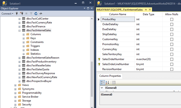
- Import the backup file into SQL Server.
- After importing the AdventureWorks into SQL server, you will have the database as follows.

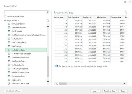
Step-3: Locate the Table dbo.FactInternetSales
- This database has a number of tables to populate Power BI with the sample data.
- We will be using the FactInternetSale table.
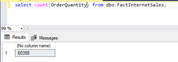
Step-4: Retrieve the total number of the records
- Issue select statement to see how many rows in the table.
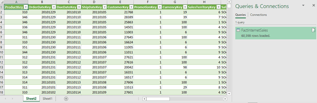
- There are 60,398 records.
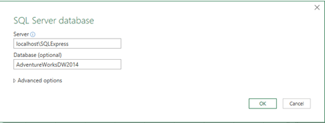
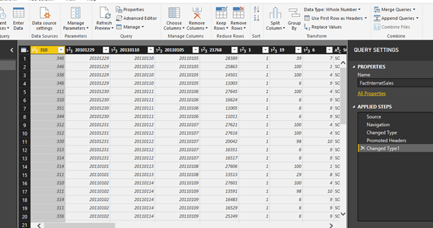
Step-5: Import the Table Content into Excel
- Open Up Excel
- Click on Data à Get Data à SQL Server.

- After loading the table in the Excel file, you will get something like the following.
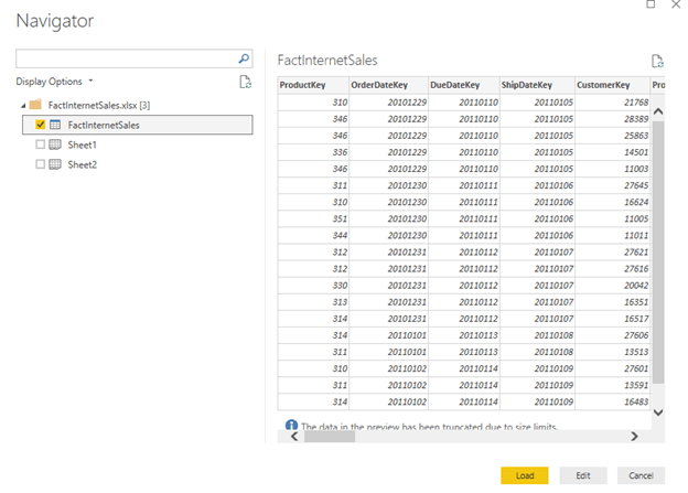
Step-5: Import Excel Into Power BI
- Get Data
- Select Excel

Step-6: Click Edit and Select Use First Row as Header
- Click on Load.
- Click Close and Apply
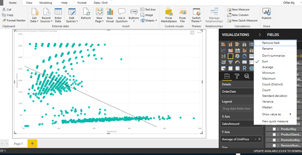
Step-7: Select the Desire Fields and Set up Their Properties
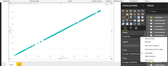
- One standard method of analyzing two numerical values on a graph is by using scatterplot graph.
- In a scatterplot graph, each value has an X-axis, and Y-axis is plotted on the graph using the values of two scales.
- You will use the fields as Average of UnitPrice and Average of SalesAmount.
- You also want to see this comparison over time, so you will add the OrderDate field in the Details section.
- Select OrderDate, SalesAmount, UnitPrice.
- Select Average of SalesAmount.
- Select Average of UnitPrice.
- Select OrderDate from OrderDate instead of Date Hierarchy.
- Select the scatterplot icon from the visualizations pane and create a blank scatterplot graph on the report layout.
- Select his blank graph, and add the fields as discussed above.
- This will create a scatterplot chart of average of unit price vs. average of sales amount over time.
Step-8: Add a Trend Line
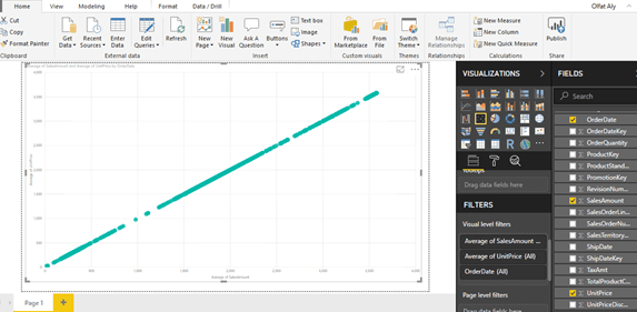
- The chart seems to show linear relationship as the points seems to be organized in a straight line, but you cannot be sure just by reviewing visually.
- The chart seems to show a series of points that are closely overlaid near or on the top of each other.
- You need an explicit indicator of the same, like a project trend line in the graph.
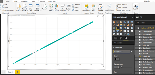
- To accomplish the same, click on Analytics Icon/Pane and you should find a trend-line option as shown below.
- Click and Add to create a new trend line.
- You can format the different options as shown below.
- After adding the trend line, the graph should look as shown below.
- This looks very trivial as you can create a trend using a line chart.
- However, this trend is more like a linear trend line used in a linear regression method where the best-fit line passes through the minimum of squares distance/variance from all the points in the plot.
- Linear regression analysis is part of statistical analysis which is part of machine learning techniques.
Step-9: Use Different Aggregation instead of Average Sales
- You can try a different aggregation to look at a different trend.
- Instead of the average of Sales Amount, change the aggregation to Sum of the Sales Amount.
- To change the aggregation, you need to right-click on the field, and select the aggregation of choice from the menu as shown below.
- Select Sum for Sales Amount
- After making the change, the trend would look as shown below.
- This shows that the trend is negative.
- As the average of unit price decreases, the sum of sales amount increases.
- From this limited trend analysis, without looking at the data, you can make an initial assumption that as the average of unit price of products increases, the sum total of overall sales decreases, but the average of sales increases.
- This indicates that for expensive products the total sales is low.
- As the number of products sold are less and the unit price is high, the average keeps on increasing shown a linear positive trend.
- In this way, trend line enables quick interpretation of the data using different aggregations with trend lines.