Dr. O. Aly
Computer Science
The purpose of this project is to analyze a dataset using the correlation analysis and correlation plot in PowerBI.
- Correlation Analysis is a fundamental method of exploratory data analysis to find a relationship between different attributes in a dataset.
- Statistically, correlation can be quantified by means of a correlation coefficient, typically referred as Pearson’s co-efficient which is always in the range of -1 to +1.
- A value of -1 indicates a total negative relationship and +1 indicates a total positive relationship.
- Any number closer to zero represents very low or no relationship at all. There is a statistical calculation involved to find this co-efficient and using this you can identify the correlation between two attributes with numerical data.
- It can be a very statistically intensive process if the task is to identify correlation between many numeric variables.
- Correlation plots can be used to quickly calculate the correlation coefficients without dealing with a lot of statistics, effectively helping to identify correlations in a dataset.
Step-by-Step Instruction
Step-1: Install the R Package for Correlation Plot
- Power BI provides correlation plot visualization in the Power BI Visuals Gallery to create Correlation Plots for correlation analysis.
- In this tip we will create a correlation plot in Power BI Desktop using a sample dataset of car performance. It is assumed that Power BI Desktop is already installed on your development machine. So please follow the steps as mentioned below.
- This visualization makes using of the R “corrplot” package. The same plot can be generated using the R Script visualization and some code. Instead this visualization eliminates the need for coding and provides parameters to configure the visualization.
- The first step is to download the correlation plot
- Install the R correlation package.
- From the File à Import à custom visual from marketplace


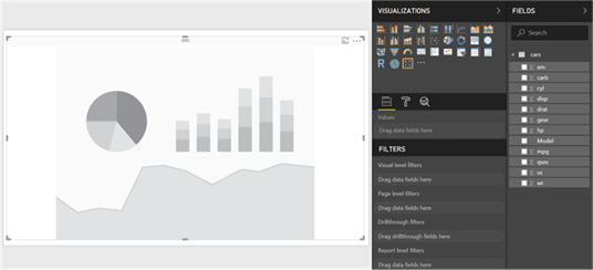
Step-2: Expand the correlation plot to the entire area
- After the correlation plot is added to the report layout, enlarge it to occupy the entire available area on the report. After you have done this, the interface should look as shown below.

Step 3: Download the CSV file (cars.csv)
- Now that you have the visualization, it is time to populate it with some data on which correlation analysis can be performed.
- You need a dataset with many numerical attributes.
- Please use the file provided with this workshop called cars.csv. You can also download it from the following site: https://www.kaggle.com/huseyinrakun/carscsv
- The file contains data on car performance with metrics like
- miles per gallon,
- horsepower,
- transmission,
- acceleration,
- cylinder,
- displacement,
- weight,
- gears, etc.
- Click on the Get Data menu and select CSV since we have the data in a csv file format.

Step-4: Edit the file and select “Use First Row as Header”
- This will open a dialog box to select the file.
- Navigate to the downloaded file and select it.
- This will read a few records from the file and show a data preview as shown below.
- The column headers are in the first row.
- Click on the edit button to indicate this before importing the dataset.
- Click on the “Use First Row as Headers” to get the column names properly.
- You can also rename the Car Names column and name it Model.


Step-5: Apply the changes
- After you apply the setting, the column names should look as shown below.
- Click on the Close and Apply button to complete the import process.


Step-6: Import the data into the Power BI Desktop
- The model should look as shown below.
- Select the fields and add them to the visualization.
- Click on the visualization in the report layout and add all the fields from the model except the model field which is a categorical / textual field.
- The visualization would look as shown below.


Step-7: Points for consideration when reading the plot
- The dark blue circles in a diagonal line from top left to bottom right shows correlation of an attribute with itself, which is always the strongest or 1. So this should not be read as correlation, but just as a separator line.
- The more the circle has a dark blue color, it signifies stronger positive correlation. The darker the red color, it signifies a negative correlation. Lighter or white colors signifies weak or no correlation.
- The scale can be used to estimate the correlation coefficient value.
Step-8: A Few Modifications in the Plot to Make it Visually Analyzable
- Make a few modifications in this plot to make it visually analyzable.
- Click on the Format option, in the Labels section and increase the font size, so that the field labels are clearly visible as shown below.
- As you can see, weight (wt) has a strong positive correlation with displacement (disp) and miles per gallon (mpg) has a strong negative correlation with weight (wt).
- The data is shown in a matrix format and there are many positive and negative correlation spreads in the plot.


Step-9: Draw a Cluster
- It would be easier to analyze correlation if attributes with the same type of correlation are clustered together.
- To do so, select the correlation plot parameters and set the “Draw clusters” property to “Auto”. This will cluster and reorganize the attributes as shown below.

Step-10: Add Number for Easy Analysis
- The strength of the correlation is still shown by the depth of the color.
- It would be easier to analyze the data if it is shown by a number indicating this strength – i.e. correlation coefficient.
- To do so, switch On the Correlation Coefficients section and increase the font size, so that you can see the coefficient clearly.
- Using the values as a reference, you can easily find out the strongest and weakest correlation in the entire dataset.
- There are other sections for formatting the data, but those are mostly related to cosmetic aspects of the plot like title, background, transparency, title, etc.
- You can try to modify those settings and make the plot more suitable to the theme of the report.
- You can add Title from the Format section.
- With Power BI, without digging into any coding or complex statistical calculations, one can derive correlation analysis from the data by using the correlation plot in Power BI Desktop.


